ADVANCED TYPOGRAPHY - EXERCISES

See Zi Yi 0340094
Advanced Typography
Exercises
LECTURE
Week 0 (06/04/2020)
To avoid the pressure of starting all modules at the same time, Mr Vinod conducted a head start class for Advanced Typography for those who wanted to start working on the coursework right away. I thought it would be nice to start so I will have more time for other subjects hence I joined the ZOOM session this morning. The e-learning session started off with Mr Vinod briefing us about our exercises through the MIB booklet, as well as conducting a short lecture on the topic: Typographic Systems. He explained the 8 Typographic systems briefly by giving us examples of each with Kimberly Elam's Typographic Systems.
8 Typographic System
1. Axial System - Text would align to one or more axis which creates a very organized feeling to the viewers' eyes.
 |
| Fig. 1.1 Axial System |
2. Radial System - Text would branch out from one or more focus point, which forms a circular visual impact.
 |
| Fig. 1.2 Radial System |
3. Dilational System - Text would circulate around a focal point.
 |
| Fig. 1.3 Dilatational System |
4. Random System - Text is placed in a random yet systematic manner.
 |
| Fig. 1.4 Random System |
5. Grid System - All text is fit neatly in columns and grids.
![[ typography ] Ba, Blake & Allen Design](https://i.pinimg.com/564x/e8/43/d6/e843d666c0415e7de70e8fe54b720a15.jpg) |
| Fig. 1.5 Grid System |
6. Transitional System - Text is arranged in such a way where movement is created.
 |
| Fig. 1.6 Transitional System |
7. Bilateral System - This is one of the most common systems where the text is centralized.
 |
| Fig. 1.7 Bilateral System |
8. Modular System - This system is similar to the grid system but the tricky part is that text boxes must be in the same size as one another. Text boxes can switch their positions from one to the next.
 |
| Fig. 1.8 Modular System |
Week 1 (14/04/2020)
Mr Vinod briefed us on the module again, through a Facebook LIVE session. There are a few points I noted down:
1. There are two considerations while working on this exercise: one, the rules of typography; two, the information hierarchy (always give prominence to the more important ones).
2. Random system: There's a method in the madness.
3. Ctrl + B to adjust the text's alignment (e.g. top, centre, bottom).
4. Text wrapping feature to create dilatational text.
Week 3 (28/04/2020)
Group 3 presented a lecture with Google Slides on the topic: Typographic Perception and Organization. Below are the slides.
Week 4 (05/05/2020)
Today's lecture is on the topic: Context and Creativity. This topic elaborates on the compressed History of Roman Typeface, from how it begins from the olden days till the Roman typeface we use today. Mr Vinod also posted a Youtube video for the lecture of this topic.
Fig. 1.9 PDF (Context and Creativity)
INSTRUCTIONS
Exercises
(1) Typographic Systems
06/04/2020
For the first exercise, we have to explore the 8 Typographic System: axial, radial, dilatational, random, grid, modular, transitional and bilateral with the following content. Only one title should be picked.
"The Design School,
Taylor's University
All Ripped Up: Punk Influences on Design
or
The ABCs of Bahaus Design Theory
or
Russian Constructivism and Graphic Design
Open Public Lectures:
November 24, 2020
Lew Pik Svonn, 9AM-10AM
Ezrena Mohd., 10AM-11AM
Suzy Sulaiman, 11AM-12PM
November 25, 2020
Muthu Neduraman, 9AM-10AM
Fahmi Reza, 10AM-11AM
Fahmi Fadzil, 11AM-12PM
Lecture Theatre 12"
Then, we were assigned to work on the first Typographic system: axial system. It is a system where text would branch out from a single line from the left and right side, which Mr Vinod described it as "leaves branching out the branch". Below is my first attempt.
 |
| Fig. 1.1 Axial System (First Attempt) |
Mr Vinod commented that I still need more exploration and hence I came up with more layout designs as shown below.
 |
| Fig. 1.2 Axial System (Second Attempt) |
 |
| Fig. 1.3 Radial System (First attempt) |
 |
| Fig. 1.4 Dilatational System (First Attempt) |
 |
| Fig. 1.5 Random System (First Attempt) |
 |
| Fig. 1.6 Grid System (First Attempt) |
With the feedback given, I improvised my work again, showed them to the lecturers for feedback. A slight amendment on the leading for grid system's first attempt is made.
 |
| Fig. 1.7 Grid System (Before) |
 |
| Fig. 1.8 Grid System (After) |
 |
| Fig. 1.9 Axial System (FINAL Typographic System: JPEG) |
 |
| Fig. 1.10 Radial System (FINAL Typographic System: JPEG) |
 |
| Fig. 1.11 Dilatational System (FINAL Typographic System: JPEG) |
 |
| Fig. 1.12 Random System (FINAL Typographic System: JPEG) |
 |
| Fig. 1.13 Grid System (FINAL Typographic System: JPEG) |
 |
| Fig. 1.14 Modular System (FINAL Typographic System: JPEG) |
 |
| Fig. 1.15 Transitional System (FINAL Typographic System: JPEG) |
 |
| Fig. 1.16 Bilateral System (FINAL Typographic System: JPEG) |
Below are the PDF files.
Fig. 1.17 Compilation (FINAL Typographic System: PDF)
(2) Type and Play
Part 1
As for our first exercise of Type and Play, we were assigned to make a selection of image between man-made objects (chair, glass, etc.) or structures (buildings), and even nature (human, landscape, leaf, etc). Within the chosen picture, analysis and dissection of letters should be made to extract potential letterforms. Then, digitize the letters. It is expected that through a process of iteration the forms would go from crude representation to a more refined celebration that would reflect a degree its origins. Always remember, don't lose its origin while refining.
I chose a picture of an expanded rhombus and hexagon basket weave which is inspired by Joel Cooper's design. I felt that there's a lot of potential in it hence I gave it a try.
 |
| Fig. 2.1 Original Image (JPEG) where letters are extracted |
 |
| Fig. 2.2 Cropped image with lower opacity |
 |
| Fig. 2.3 Outlined image |
Below are the letters I have dissected: C, E, O S, and V from the image.
 |
| Fig. 2.4 The first extraction of the digitized letter "C" (from the original image) |
 |
| Fig. 2.5 The first extraction of the digitized letter "C" |
 |
| Fig. 2.6 The first extraction of the digitized letter "E" (from the original image) |
 |
| Fig. 2.7 The first extraction of the digitized letter "E" |
 |
| Fig. 2.8 The first extraction of the digitized letter "O" (from the original image) |
 |
| Fig. 2.9 The first extraction of the digitized letter "O" |
 |
| Fig. 2.10 The first extraction of the digitized letter "S" (from the original image) |
 |
| Fig. 2.11 The first extraction of the digitized letter "S" |
 |
| Fig. 2.12 The first extraction of the digitized letter "U" (from the original image) |
 |
| Fig. 2.13 The first extraction of the digitized letter "U" |
Below are the original letters arranged on a baseline.  |
| Fig. 2.14 The first extraction of the digitized letters on a baseline |
To begin with, I plan to standardize the width of the letters as the width varies for each letter. Firstly, I reduced the opacity.
 |
| Fig. 2.15 Lowered the opacity of the letters |
Then, I created another 2 regular hexagons which are different in size and overlapped them on the extracted letter "C" to make a comparison so I can form a new letter "C" with a suitable and standardized width.
 |
| Fig. 2.16 Reducing the width of the letter "C" |
The typeface I have chosen as a reference is Future Std Book. Based on the reference typeface, I noticed that the letter "C" and "O" are wider in its size; the letter "E", "S", and "U" are more slender in size. Therefore, I refined my letters accordingly. However, I didn't follow the reference typeface exactly as I want to retain the hexagonal structure in the basketweave picture chosen earlier.
 |
| Fig. 2.17 Comparison between original letters (top) and reference typeface Futura Std Book (bottom) |
 |
| Fig, 2.18 Comparison between original letters (top) and first attempt (bottom) |
 |
| Fig. 2.19 First attempt refined letter "C" |
 |
| Fig. 2.20 First attempt refined letter "E" |
 |
| Fig. 2.21 First attempt refined letter "O" |
 |
| Fig. 2.22 First attempt refined letter "S" |
 |
| Fig. 2.23 First attempt refined letter "U" |
However, I noticed the letters look more like a rigid cubic font and do not possess the characteristic of basket weave. Therefore, I decided to add gaps in the letters, to display a weaving feeling for the font.
 |
| Fig. 2.24 Comparison between the first (top) and second attempt |
 |
| Fig. 2.25 Second attempt refined letter "C" |
 |
| Fig. 2.26 Second attempt refined letter "E" |
 |
| Fig. 2.27 Second attempt refined letter "O" |
 |
| Fig. 2.28 Second attempt refined letter "S" |
 |
| Fig. 2.29 Second attempt refined letter "U" |
Mr Vinod pointed out that my "E" needs to be wider and my "S" isn't working, so I refined them once again.
 |
| Fig. 2.30 Comparison between the second (top) and third attempt (bottom) |
 |
| Fig. 2.31 Third attempt refined letter "C" |
 |
| Fig. 2.32 Third attempt refined letter "E" |
 |
| Fig. 2.33 Third attempt refined letter "O" |
 |
| Fig. 2.34 Third attempt refined letter "S" |
 |
| Fig. 2.35 Third attempt refined letter "U" |
 |
| Fig. 2.36 Comparison between the third (top) and fourth attempt (bottom) |
 |
| Fig. 2.37 Fourth attempt refined letter "C" |
 |
| Fig. 2.38 Fourth attempt refined letter "E" |
 |
| Fig. 2.39 Fourth attempt refined letter "O" |
 |
| Fig. 2.40 Fourth attempt refined letter "S" |
 |
| Fig. 2.41 Fourth attempt refined letter "U" |
 |
| Fig. 2.42 Comparison between the fourth (top) and final attempt (bottom) |
 |
| Fig. 2.43 Letter "C" (FINAL Type and Play 1: JPEG) |
 |
| Fig. 2.44 Letter "E" (FINAL Type and Play 1: JPEG) |
 |
| Fig. 2.45 Letter "O" (FINAL Type and Play 1: JPEG) |
 |
| Fig. 2.46 Letter "S" (FINAL Type and Play 1: JPEG) |
 |
| Fig. 2.47 Letter "U" (FINAL Type and Play 1: JPEG) |
Fig. 2.48 Compilation (FINAL Type and Play 1: PDF)
(2) Type & Play
Part 2
For our final exercise, we were required to source for an image of a man-made structure/object/nature and combine it with a letter/word/sentence. The purpose of having this exercise is to have the text to support the chosen image by forming a symbiotic relationship between both of them. The words have to form intimacy and intertwine with the image seamlessly. There are a few points to take note:
- A4 size image (JPEG)
- Use the 10 typefaces
- 4-5 words/sentence/quotation
- Choose one word to be emphasized
After doing a little research on our seniors' work, I noticed most of the quotes chosen are very motivational and inspiring, while the images chosen to interplay with are humans with very dynamic poses, e.g. jumping, skateboarding etc. Hence, I wanted to try out something new, something which gives out a different vibe. When I was searching for images on Pinterest, I landed eyes on the following picture:
 |
| Fig. 3.1 Image from Pinterest |
Instead of a very motivational and dynamic vibe, this image radiates a rather laid-back and still feeling, which is something I find interesting. I also had a feeling I can further enhance the image with text, hence I decided to give it a try.
First off, I removed some obvious wood patterns on the floor with cloning on Adobe Photoshop. The cleaner the floor is, the easier it would be for me to lay out my text later. Aside from that, I lowered the brightness of the image to form a clear contrast with the text. The lines on the floor are removed as well.
 |
| Fig. 3.2 Photoshopped image |
The text I have chosen for this image is "falling for you" because in my opinion, the word "falling" can be used to interplay with the bending of the model's body while the phrase "for you" can be used to support the women's gaze towards the viewers.
Below is my first attempt:
 |
| Fig. 3.3 First attempt; Step 1 (Letters placement) |
Then, I added on some non-objective elements to create a better flow for the letters. Below are some variations for my first attempt:
 |
| Fig. 3.4 First attempt #1 |
 |
| Fig. 3.5 First attempt #2 |
 |
| Fig. 3.6 First attempt #3 |
 |
| Fig. 3.7 First attempt #4 |
After receiving feedback from the lecturers, I decided to change my title so it fits better with the image: Better bend than break. Below is my progress:
 |
| Fig. 3.8 Second attempt; Step 1 (Letters Placement & Application of "Wrap Text" option) |
 |
| Fig. 3.9 Second attempt; Step 2 (Masking of Letters) |
Then, I added on some sketchy lines to create a better flow for the letters, as well as to bring up the overall vibe. Below are two variations I created for my second attempt:
 |
| Fig. 3.10 Second attempt #1 |
 |
| Fig. 3.11 Second attempt #2 |
Below is my final submission:
|
| Fig. 3.12 FINAL Type and Play 2 (JPEG) |
Below is my final submission for this exercise:
Fig. 3.13 FINAL Type and Play 2 (PDF)
FEEDBACK
Week 0 (06/04/2020)
General Feedback:
We should be careful with our text's leading while arranging them in our layout. While designing each layout, try to make it look exciting, maybe with the help of non-objective element. We can start off this exercise by placing the information in accordance with its importance to create hierarchy, e.g. work from the title first. When there are upper and lower case letters in a sentence, downsize the upper case letters by one point to make it appear the same size as the lower case letters. Point size should be maintained between 8 to 12pt.
Specific Feedback:
My layout is too centralized which creates too much white space in the overall composition. A good balance should be maintained by minimizing the amount of white space. The title "The ABCs of Bahaus Design Theory" should not be treated differently as there is no colon (:). Leading is insufficient. Italic typeface for the speakers' names and time is redundant hence remove them. Utilizing different typefaces in one layout may make it more difficult to work around hence pick only one typeface. More exploration refinement should be done.
Week 0 (10/04/2020)
General Feedback:
Do not use multiple typefaces in one layout. Hierarchy of information should be taken into account. Always put readability and legibility first when designing a layout. Paragraph spacing must be consistent for all. Don't bunch up islands of texts. Only give letter spacing if the text is too close to each other. Before adding a non-objective element, ask yourself if your layout is working? If not, fix your layout. Non-objective elements should not overpower the texts. Use it wisely.
Specific Feedback:
1. Axial - (1) Black background formed a harsh separation as it contrasts too much with the white background. Hence remove it. (2) Looks better than (1) but the angle of the axis is too 45 degree, Reduce it.
2. Radial - Both are good.
3. Dilational - (1) Give more letter spacing for the text, don't use italic if it's already in bold. (2) Looks too simple, make it more interesting. Remove the red circle.
4. Random - (1) Improve it. (2) This has a slightly better hierarchy. Can still improve.
5. Grid - (2) This creates a better eye movement.
Week 1 (16/04/2020)
Specific Feedback on Facebook:
Well done Zi Yi. You’re turning into a natural Graphic Designer it would seem. I only have one comment on one of the artworks. The leading diff between the two is a little awkward. The ones with the green tick mark are my favs. Good job. I think you can begin looking at the next exercise. Type & Play.
Week 2 (21/04/2020)
General Feedback: Save our final submission as JPEG files, 96dpi, as spreads instead of individual pages; and label them as "Name of System (Final Submission for Typographic System)". Constantly update your blog while working on our exercises. When there are upper and lower case letters in a sentence, downsize the upper case letters by one point to make it appear the same size as the lower case letters. Point size should be maintained between 8 to 12pt. Always listen to others feedback and apply them to yours if you find it relevant.
Specific Feedback: Good job. Great.
Specific Feedback on Facebook:
1. How did you get from the one on top to the bottom so fast? And what have you retained from the original? You need to retain a characteristic.
2. Also, you need to show where you got those forms from the image.
3. Where is the hexagon here?
4. Ok.
5. You know what, next time just explain that la, you’ll save me time!
6. I think your E need to be a little wider. Your S does not work. So more refining needed.
7. Aiyoooooooo I’m on my phone so a little blind don’t have glasses 🤓 Couldn’t see the captions.
8. So what you need to do now is work on the E and S to bring it up to the same level of the rest. Then once’s that’s done, take a look at it again. Then once’s that’s done, take a look at it again.
Week 3 (28/04/2020)
General Feedback:
Letter dissection should be done intricately so our font would preserve the characteristics of the image chosen.
Specific Feedback:
Nice work. Good. But there are a few things I need to amend:
1. Reduce the amount of the gaps introduced in the letters (Try it out with one letter to see if it works, and stick with the original work if it doesn't.)
2. Reduce the width of the top stroke of "C", the bottom stroke of "S", and the right stroke of "U".
Specific Feedback on Facebook:
1. Just take note of the weight diff in the identified strokes.
2. Don’t increase the weight of any stroke (reduce to match overall stroke width for thick/thin areas of contrast exists)
3. No PDF for this, only JPEG. No specific size, just ensure there is a comfortable space around your final. Also ensure you have the version where you have the original extraction, final refinement and reference typeface.
4. Hi, Just follow this sample: https://vedhavania.blogspot.com/2019/04/advanced-typography.html. PDF and all. You can estimate the size necessary for you artboard.
General Feedback:
The image shouldn't dominate the text. The text must mimic certain elements.
Specific Feedback:
1. The word "falling" should interplay better with the model.
2. It's too simplistic and needs to get more sophisticated.
3. "Falling" should mimic the person in your image.
4. However, it doesn't seem like she's falling.
Specific Feedback on Facebook:
Cool. No (changes). I think you can concentrate on the next task.
Week 5 (12/05/2020)
General Feedback:
Key artwork is identity design. Even if there is variation, typography and visual identity should be maintained on all collaterals. We need to make a critical evaluation of our work and never have this mindset that "I am just a student". This is because will be shocked when we see some of the nice work is actually university students' work. Also, we need to attach the reference which we used for our presentation's content.
Specific Feedback:
The distortion of the letters look a bit disturbing but it still works. The work works better with the non-objective elements. Good job on my e-portfolio.
It would be best if you can reflect the entire article on the key artwork, but if not, just pick a concept and work on it.
REFLECTION
Experience
Week 0 (06/04/2020): Due to the MCO, online learning is carried out to replace face-to-face classes and today's the first day of class. It was something new but also an exciting experience for everyone. I enjoyed the class overall and also had the privilege to receive detailed feedback on my work; Week 1 (14/04/2020): I am glad I had the chance to revise on several important points on layout design while Mr Vinod explained during the Facebook LIVE session, and they are now etched in my head; Week 2 (21/04/2020): It was insightful and inspiring looking at how our seniors did their Type and Play exercise 1 as their end results are very interesting! It made me want to do better for mine as well; Week 3 (28/04/2020): We had our lecture conducted by our classmates today and I think it's a great way for us to understand about Typography concepts; Week 4 (05/05/2020): Having our feedback session on Microsoft Teams was chaotic at first, as the audio was quite bad. But it was fine after a while; Week 5 (12/05/2020): A few suggestions on online learning were proposed by our classmates and I think the suggestions really help to improve our online learning experience. It's extremely important to voice out our concerns so we can go through this tough time together.
Observation
Week 0 (06/04/2020): There were a few incidents during the video call, such as the line being cut off all of a sudden or screen appearing laggy but other than that, it was fine. I like the fact that we can share screens to receive feedback from the lecturers, as well as having a look at our friends' work. Not only did I learn through my feedback, but also through my friends' work and the feedback they received; Week 1 (14/04/2020): Since I started working on the exercise beforehand, I find myself catching up with the class pretty easily. I too noticed I could figure out the steps and keys to perform certain tasks on InDesign with ease; Week 2 (21/04/2020): I observed that whenever the lecturers give feedback on my classmates' work, I will subconsciously check if I have made the same mistake as well; Week 3 (28/04/2020): I realized that sometimes I would get very worried when it comes to sharing my work with the class and even forgot to turn on my microphone. I just hope I won't get panic that easily next time; Week 4 (05/05/2020): I observed that when I started analyzing my friends' work, I knew how to improve mine, as I started thinking critically as in ways to improve my work; Week 5 (12/05/2020): My friends gave a really good presentation today and I was awed at how much effort they invested in doing it. They even have up to 72 slides and presented very thoroughly slide by slide.
Findings
Week 0 (06/04/2020): I found, in fact, we can learn quite efficiently through online classes despite the little bumps we encountered. We don't have to deal with issues like not being able to view the lecture slides clearly or not hearing the lecturers' sound, like how we did in class. Online lessons aren't so bad after all. Also, having small classes encourages more interactivity; Week 1 (14/04/2020): Being in the headstart group really is a smart choice as I am done with my first exercise by now. No regrets; Week 2 (21/04/2020): The feedback session can be very detailed but will even exceed the class hours. Nevertheless, I am glad the lecturers are willing to spare more time with us; Week 3 (28/04/2020): I found that my friends are really creative in expressing their ideas, some of them already seem like professional to me; Week 4 (05/05/2020): I found a few friends' works very interesting and they inspired me to further enhance my work; Week 5 (12/05/2020): Having good time management is extremely important as we have to work on various tasks at the same time. And I think I am doing great. Also, as much as I want to produce good work, it's important for me to take note of the time frame allocated for each task, so I can be on track.
Week 0 (06/04/2020): I found, in fact, we can learn quite efficiently through online classes despite the little bumps we encountered. We don't have to deal with issues like not being able to view the lecture slides clearly or not hearing the lecturers' sound, like how we did in class. Online lessons aren't so bad after all. Also, having small classes encourages more interactivity; Week 1 (14/04/2020): Being in the headstart group really is a smart choice as I am done with my first exercise by now. No regrets; Week 2 (21/04/2020): The feedback session can be very detailed but will even exceed the class hours. Nevertheless, I am glad the lecturers are willing to spare more time with us; Week 3 (28/04/2020): I found that my friends are really creative in expressing their ideas, some of them already seem like professional to me; Week 4 (05/05/2020): I found a few friends' works very interesting and they inspired me to further enhance my work; Week 5 (12/05/2020): Having good time management is extremely important as we have to work on various tasks at the same time. And I think I am doing great. Also, as much as I want to produce good work, it's important for me to take note of the time frame allocated for each task, so I can be on track.
FURTHER READINGS
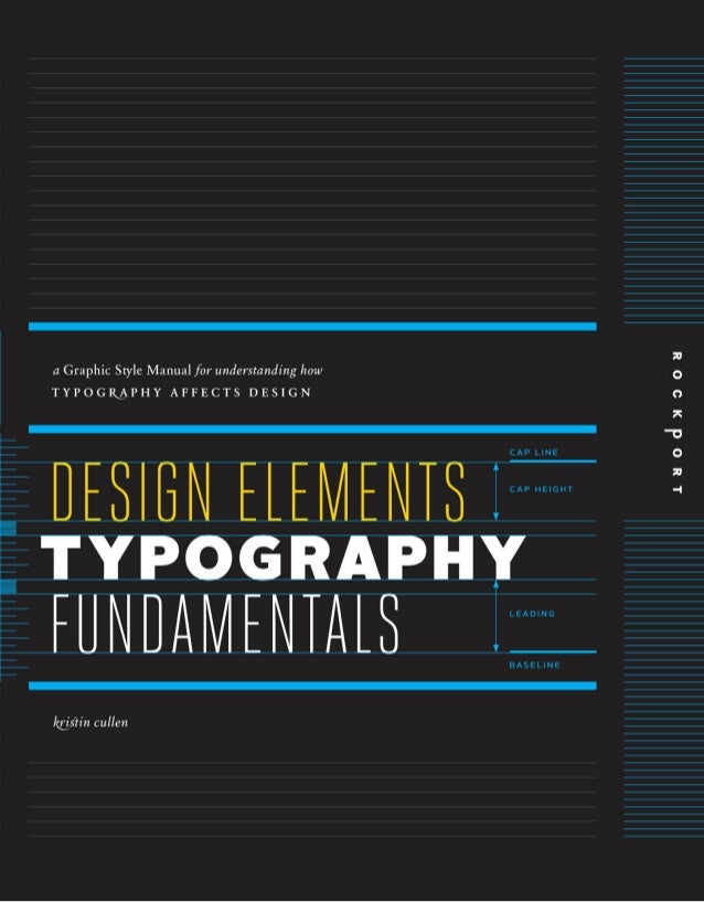
Week 1 (17/04/2020) (Chapter 3: On Typeface, pg.46)
Book title - Design Elements, Typography Fundamentals: A Graphic Style Manual for Understanding How Typography Affects Design
Book Author - Kristen Cullen
 |
| Fig. 1.1 Book cover |
In this book, readers are enlightened with the fundamentals of typography which teaches the language of type and how to use it capably. Concepts are explained with pictures and figures to improve the understanding of readers as well. Below are some new things I learnt:
1. Analphabetics
- They are characters used with
the alphabet and are not included in its
alphabetic order (or ABCs), which include
punctuation, diacritics (accent or diacritical marks), and symbols.
- Punctuation
marks: clarify text structure and meaning, e.g. apostrophes,
commas, and periods. Diacritics: auxiliary marks that combine
with letterforms and indicate a distinct
sound or vocal emphasis.
- Symbols, such
as arithmetical and currency signs, as
well as copyright and registered marks,
are special-purpose characters.
Despite using them quite frequently, I didn't really get to know their names. It was through reading this book I understand more about them.
 |
| Fig. 1.2 Analphabetics |
Week 2 (21/04/2020) (Chapter 4: Typesetting Factors, pg.114)
Book title - Design Elements, Typography Fundamentals: A Graphic Style Manual for Understanding How Typography Affects Design
Book Author - Kristen Cullen
|
| Fig. 1.3 Book cover |
1. Aesthetic Tailoring
- This is the final typesetting phase when designing with type for communication. Called micro typography, it ensures refined type settings. This step required enhanced sensitivity to typographic detail.
(1) Maintain proper typeface proportions.
Use only
available styles—posture, weight, and width—
of chosen typefaces, which have been carefully
considered and proportioned by type designers.
Select italic or oblique fonts from within the
typeface. Avoid altering roman styles by slanting,
thus creating objectionable “fake italics.”
(2) Maintain baseline relationships.
Baselines are
imaginary lines on which letterforms, words,
lines, and paragraphs are placed on. Letterforms maintain
shared baselines, which support left to right
reading patterns. However, the stacking type breaks the natural reading flow. Hence, this is not advised.
(3) Match combined typefaces optically when being arranged side by side. When setting multiple typefaces,
carefully review the size relationships between
them. Match them optically, not by point size.
At the same size, one typeface can look larger
or smaller than another set side by side. It's important what comes to sight at first glance.
(4) Choose roman (or regular) brackets, curly brackets,
and parentheses. Brackets, curly brackets, and
parentheses remain upright (roman or regular)
even if the text inside them is italic.
 |
| Fig. 1.4 Examples of aesthetic tailoring on type |
Comments
Post a Comment