DESIGN PRINCIPLES - EXERCISES & PROJECTS

Week 1 (26/09/19) - Week 14 (11/11/19)
See Zi Yi (0340094)
Design Principles
Exercises & Projects
___________________________________________________________________________
Initially, I intended to have a Chinese papercutting in the middle of the circle, but I found out that it would be too similar to the Chinese lantern, as they are both red in colour. Hence, I decided to use my surname in Chinese(徐), typed in a Chinese calligraphy typeface.
Then, I moved my workspace from Adobe Photoshop to Adobe Illustrator because I need to fill the colour of the circles. I realized the girl which I illustrated earlier in Illustrator was pixelated, as it's converted from one format (vector, when illustrated) to another (raster, when in Photoshop). Hence, I had to export the layers individually as PNG files to be included in the final work.
I intended to add Chinese couplets on the outmost circle with the lanterns as sketched in my draft, but I wanted to make the couplet interesting by using informal phrases, such as "eat well and sleep well" in the figure below to attract attention, in contrast to the typical formal greetings seen on Chinese couplets. However, I didn't move on with this idea because it will look too crowded.
Then, I proceeded with filling the colours for the circles. I chose blue as the colour theme so it will create contrast with the human figure in pink.
The elements were imported and added accordingly. To create contrast, I changed the colour of my Chinese surname from black to light grey.
This artwork illustrates the relationship I have with my culture - the Chinese culture - through a series of elements that speak about the cultural experiences I have come across. The background of the image was inspired by the Chinese courtyard seen in ancient Chinese dramas and was created based on a worm's eye view. With this perspective, viewers will have the feeling of entering a tunnel, which then gradually guides them from the entrance to the core of the tunnel. To display hierarchy, I arranged the elements according to the level of influence it has on me. Starting from the outermost layer, there are red Chinese lanterns are seen during Chinese New Year as decoration at the entrance, which is also another reason why I placed it at the outermost layer - as a symbol of welcoming myself/others to walk into my world. The second layer shows Chinese stamps and postcards I received from my Chinese pen-pals, which I scanned and Photoshopped them to create a nicer flow with the circles. As for the final layer, I used the black and white side profiles of the two main protagonists from Farewell My Concubine, as it's the first Chinese movie which introduces me about Beijing Opera, a type of Chinese cultural performance, that I have watched. This is the artwork which I did for my first Design Principles class, and I find it meaningful to include in my last one, to symbolize the end might be a starting of something new. Lastly, my Chinese surname (徐) in Chinese calligraphy typeface. It is placed at the core of the circle not only because it represents part of my identity, but also because of the significance of Chinese calligraphy, the Chinese art of writing, to me. Learning about Chinese calligraphy gave me the opportunity to learn and experience more about my culture. And I wouldn't have developed my interest in my culture if it wasn't for calligraphy. This is why I had it placed at the core of the circle, at my heart. It also sets as a reminder for me to always art with heart, which is to create every art with all my heart.
5. Texture: There are different brush texture used, such as the normal soft brush and the crayon-liked brush to make the composition more interesting.
6. Perspective: A worm's eye perspective is used where the objects are viewed from the bottom to top; a one-point-perspective is used as well, where all of the objects are appearing from one point, with the closer ones bigger in size and more visible, and the further ones smaller in size and less visible.
Feedback.
Miss Sherry said I did an excellent job and mentioned that she likes how I showed contrast by choosing a dark blue background as opposed to the warm colours of the elements on it. Several of my classmates complimented about the colour contrast created and the perspective displayed in my artwork.
___________________________________________________________________________
Week 11 (04/11/19 - 10/11/19): Final Project
For our final project, we are required to come up with an art piece which describes our relationship with culture, after doing some research on places recommended by the lecturers. While researching, we are told to look into the place's history, attractions, current activities, types of people, visual elements, lighting, event, food, etc.
Research at Petaling Street
On 29th October 2019, my friend and I paid a visit to the Central Market (Pasar Seni) by taking the LRT. Before visiting the Central Market, we passed by the Petaling Street hence we also did some research at the place.
Petaling Street is a bustling shopping district with haggling vendors offering a range of goods, from clothing to food. Chaotic but charming, Petaling Street Market is accessible by numerous buses, trains, taxis, and rickshaws, and the site is easily recognizable--it has multiple, well-marked entrances, the primary entrance marked by a giant red arch marked “Jalan Petaling” in striking gold script.
Historically known as “Market Square,” Petaling Street is located in the heart of Kuala Lumpur’s original Chinatown. Established around the same time as the city, Petaling Street has been active since the mid-19th century and has gone through various stages in its cultural evolution. In 2007, Petaling Street underwent a multi-million dollar development that focused on two streets, Petaling and Jalan Hang Lekir--the former focusing on goods, and the latter on foods. These roads were paved with red tiles and covered with a dragon-like canopy that keeps out sun, but not rain. With a wet market in the early mornings, Petaling Street is one of the most active hubs of activity, trade, and social life in Kuala Lumpur.
Reference: https://www.pps.org/places/petaling-street-market
For the final project, I planned to show my relationship with Chinese culture as it's the main culture I grew up with, aside from other cultures. Hence, I looked for Chinese-related elements when I was conducting my research. Below are some of the pictures which I find relevant to my chosen culture.
The Guan Di Temple is the first cultural building we encountered while we were walking around Petaling Street. The origin of this temple comes from one of China’s greatest warriors known as General Kwan, Guan Di or Guan Yu. He was given the title of ‘God of War’ and many had chosen to worship him due to his excellent fighting and war skills. It is believed that the well-being of a person can be achieved with his blessings and protection. However, the God of War will only grant wishes to those with a pure mind. I find it relevant to me because my family and I would visit the Chinese temple back in my hometown during festive seasons. Hence, it reminds me of my relationship with culture.
Furthermore, Petaling Street also has a variety of food stalls, one of which stall which I find very relevant to me is this stall which sells bak kwa (Fig. 11.5). Bak kwa, also known as rougan (肉干), is a dried savoury sweetmeat that traditionally takes the form of thin square slices and is usually made from pork. Bak kwa is thought to have derived from a meat preservation and preparation technique used in ancient China and it's a famous snack eaten during Chinese New Year.
Reference: http://eresources.nlb.gov.sg/infopedia/articles/SIP_1746_2010-12-30.html
Lost in Chinatown is another Petaling Street attraction we visited. This is an attraction dedicated to the exploration of Chinese art, culture and tradition. Additionally, it is also a venue that allows visitors to learn about other Malaysian attractions and cultures, such as the Indian and Malay culture.
There is also a "Celebrity Maze" that consists of over 200 World Famous Pop Art, and tourist s/participants will need to complete the mission in the dark maze. Unfortunately, it's under a renovation when we visited the place.
As the name itself suggests, Lost in Chinatown has a lot of Chinese elements featured, some of which I found are Chinese lanterns and Chinese couplets. Below are the images taken while I visited this place.
Based on my research, it is said that different colours of lanterns have a different meaning. While red lanterns are commonly seen in Chinese households during Chinese New Year, the Chinese, in general, would use white lanterns to symbolize death and mourning. The lanterns would be accompanied by a white sash across the top of the doorway—indicate that a death has occurred in that household. However, white lanterns can also be used as decoration and aesthetic purpose as seen in Fig. 11.9 in the shop.
Reference: https://www.thespruce.com/use-fruit-symbols-for-good-feng-shui-1274660
Research at Petaling Street
On 29th October 2019, my friend and I paid a visit to the Central Market (Pasar Seni) by taking the LRT. Before visiting the Central Market, we passed by the Petaling Street hence we also did some research at the place.
Petaling Street is a bustling shopping district with haggling vendors offering a range of goods, from clothing to food. Chaotic but charming, Petaling Street Market is accessible by numerous buses, trains, taxis, and rickshaws, and the site is easily recognizable--it has multiple, well-marked entrances, the primary entrance marked by a giant red arch marked “Jalan Petaling” in striking gold script.
 |
| Fig. 11.1 The primary entrance of Petaling Street |
Historically known as “Market Square,” Petaling Street is located in the heart of Kuala Lumpur’s original Chinatown. Established around the same time as the city, Petaling Street has been active since the mid-19th century and has gone through various stages in its cultural evolution. In 2007, Petaling Street underwent a multi-million dollar development that focused on two streets, Petaling and Jalan Hang Lekir--the former focusing on goods, and the latter on foods. These roads were paved with red tiles and covered with a dragon-like canopy that keeps out sun, but not rain. With a wet market in the early mornings, Petaling Street is one of the most active hubs of activity, trade, and social life in Kuala Lumpur.
Reference: https://www.pps.org/places/petaling-street-market
For the final project, I planned to show my relationship with Chinese culture as it's the main culture I grew up with, aside from other cultures. Hence, I looked for Chinese-related elements when I was conducting my research. Below are some of the pictures which I find relevant to my chosen culture.
 |
| Fig. 11.2 Guan Di Temple |
The Guan Di Temple is the first cultural building we encountered while we were walking around Petaling Street. The origin of this temple comes from one of China’s greatest warriors known as General Kwan, Guan Di or Guan Yu. He was given the title of ‘God of War’ and many had chosen to worship him due to his excellent fighting and war skills. It is believed that the well-being of a person can be achieved with his blessings and protection. However, the God of War will only grant wishes to those with a pure mind. I find it relevant to me because my family and I would visit the Chinese temple back in my hometown during festive seasons. Hence, it reminds me of my relationship with culture.
 |
| Fig. 11.3 Chinese lanterns |
I also spotted some Chinese lanterns outside of the Pacific Express Hotel, in Petaling Street. These lanterns reminded me of Chinese New Year as it's the Chinese cultural festival I celebrate with my family the most. According to my research, red lanterns represent harmony, as it's round in shape, booming in business like fire (red colour). It also represents happiness, vitality, and wealth. This is the reason the Chinese like to hang red lanterns in parties or festivals, such as Chinese New Year, lantern festivals, etc.
Below are some other lanterns I found at Petaling Street which shows that there's a variety in the types of lanterns present today.
 |
| Fig. 11.4 Some other lanterns found in Chinese shops |
Pineapple is a fruit which is often seen incorporated in various Chinese art. This is because the sound of the Chinese word for pineapple is close to the sound of “good luck coming your way,” so the pineapple has become a popular traditional feng shui symbol of wealth, fortune, and prosperity. This explains why pineapple-shaped lanterns are found at Chinese shops (Fig. 11.4).
 |
| Fig. 11.5 A Chinese snack, Bak kwa, stall |
Furthermore, Petaling Street also has a variety of food stalls, one of which stall which I find very relevant to me is this stall which sells bak kwa (Fig. 11.5). Bak kwa, also known as rougan (肉干), is a dried savoury sweetmeat that traditionally takes the form of thin square slices and is usually made from pork. Bak kwa is thought to have derived from a meat preservation and preparation technique used in ancient China and it's a famous snack eaten during Chinese New Year.
Reference: http://eresources.nlb.gov.sg/infopedia/articles/SIP_1746_2010-12-30.html
 |
| Fig. 11.6 Noodles with prawn dumplings |
Speaking of food, we stopped by a Chinese hawker stall which sells really great "Har Gaw", also known as prawn dumplings. I ordered a bowl of it and it comes together with soup noodles. According to my research, shrimp dumplings were traditionally made with shrimp, pork, and bamboo shoots. Now, it is more popular with just shrimp filling. The standard shape should be a plump half moon, with a minimum of seven, but preferably 12, folds. It is said that a good Har Gaw is juicy, with thin, translucent skin that won't break when picked up with chopsticks and won't stick together.
Lost in Chinatown is another Petaling Street attraction we visited. This is an attraction dedicated to the exploration of Chinese art, culture and tradition. Additionally, it is also a venue that allows visitors to learn about other Malaysian attractions and cultures, such as the Indian and Malay culture.
 |
| Fig. 11.7 Wax statue of Bruce Lee at the entrance |
There is also a "Celebrity Maze" that consists of over 200 World Famous Pop Art, and tourist s/participants will need to complete the mission in the dark maze. Unfortunately, it's under a renovation when we visited the place.
 |
| Fig. 11.8 Celebrity Maze which was under renovation |
As the name itself suggests, Lost in Chinatown has a lot of Chinese elements featured, some of which I found are Chinese lanterns and Chinese couplets. Below are the images taken while I visited this place.
 |
| Fig. 11.9 White-coloured Chinese lantern |
 |
| Fig. 11.10 Red-coloured Chinese lantern |
Based on my research, it is said that different colours of lanterns have a different meaning. While red lanterns are commonly seen in Chinese households during Chinese New Year, the Chinese, in general, would use white lanterns to symbolize death and mourning. The lanterns would be accompanied by a white sash across the top of the doorway—indicate that a death has occurred in that household. However, white lanterns can also be used as decoration and aesthetic purpose as seen in Fig. 11.9 in the shop.
Reference: https://www.thespruce.com/use-fruit-symbols-for-good-feng-shui-1274660
 |
| Fig. 11.11 Chinese couplet |
Instead of being written with blank ink on red paper, the Chinese couplet in Fig. 11.11 is created with Chinese words being carved on the wood, as this is known as the column couplet. There are three categories of Chinese couplets, namely: the spring couplet, the hall couplet and the column couplet. The spring couplet is written in Chinese black ink on red paper and will be displayed vertically one on each side of the door; the hall couplet, also known as the hanging scroll, is usually put up in the centre of the main hall of each household; the column couplet, on the other hand, is usually carved on the columns of architecture.
Reference: https://www.chinahighlights.com/travelguide/culture/chinese-couplets.htm
Research at the Central Market
According to the official website of Central Market, it is stated that this a centre for Malaysian culture, art and craft located in the heart of the city. As a building with significant historical value, Central Market Kuala Lumpur has come a long way from its early beginning as a wet market built-in 1888 to a delightful destination for tourists, shoppers and art lovers.
Today, Central Market Kuala Lumpur is a must-visit destination offering visitors a unique shopping opportunity where they can relish not just a retail experience but also a heritage experience offering a wonderful visual treat and appreciation of Malaysia heritage and architecture in a glance as they step into its doors.
While I was in the Central Market, I found a booth which offers people to experience Chinese calligraphy on the spot, with a charge of RM30. Looking at these reminds me of my childhood, as I learnt Chinese calligraphy since young and it's an amazing cultural experience for me. Chinese calligraphy is a type of artistic writing introduced during the Han dynasty and has been widely practised in China, as well as other countries in Southeast Asia today.
Besides, Qing Hua porcelain, or more commonly known as blue and white porcelain, are also found in some shops. Blue and white porcelain is contrived using the colour blue, usually from cobalt oxide, to create designs on shaped clean, white clay that is then covered in a layer of transparent glaze and baked in a kiln at high temperatures. Traces of blue and white wares are found beginning in the Tang dynasty (618-907) but it was not until the Yuan dynasty (1271-1368) that the art reached perfection.
Reference: http://www.chinaonlinemuseum.com/ceramics-blue-and-white-porcelain.php
Idea development and Process
With the information I have collected, I started to brainstorm for ideas and sketched them out on my sketchbook. My initial idea was to create a collage with things that symbolize my relationship with culture by making the photos into polaroid sizes and pasting them on the paper as if it's the wall. Polaroid is a photograph, and I think photographs can speak about the relationship we have with something because it's one of the ways to treasure memories.
After I was done with tracing the girl, I proceeded with illustrating the circles which will be used to lay my elements on.
Then, I filled the colour for each part traced. I used the eyedropper tool so I can get the exact colour from the stock image.
However, I don't think that the colours used in the stock image are relevant to the culture I want to represent, as Chinese culture mainly revolves around shades of red. Hence, I searched up for Chinese colour palette, which I used as my colour reference.
After I was done with colouring, I reduced the opacity of the coloured parts, so I could add more texture to the human figure, by adding lines which represent the lighter shade of the pants.
Upon completion of illustrating on Adobe Illustrator, I then exported the illustrated files to Adobe Photoshop, as I planned to edit the rest of the elements in there. There were exported as PNG as this is the file format that guarantees a transparent background.
Then, I imported the files on Adobe Photoshop as layers. The pictures of other Chinese elements were also opened to I can mask and drag them to the main folder.
"Masking" was done on the elements after I cropped the specific Chinese lantern chosen with the "Quick Selection Tool". "Masking" is used to show and hide certain parts of an image. In this case, masking is used to hide the unwanted parts of the image, showing/leaving only the Chinese lantern I needed.
Since the direction of the lantern facing towards isn't accurate, I then flipped it vertically by using the "Transform" tool.
A lantern which is smaller in size is added to show a hierarchy of elements and scale. Its saturation value is reduced to show that it's further away from the first huge lantern.
Then, I opened the files of other elements, masked them and dragged them to the main file to be arranged accordingly.
I didn't include the orange postcard as it stands out too much from the rest, as I wanted to keep the second layer with elements of duller colours.
Then, I realized it was rather awkward to have the stamps to be placed statically, as they do not follow the spiral-shaped layer I created. So, I decided to experiment with something new to me, which was the "Puppet Warp". "Puppet Warp" is used to pin objects on the canvas and distort specific areas of the object as if it's a puppet.
Reference: https://digital-photography-school.com/use-puppet-warp-photoshop/
However, before I use this tool, I adjusted the perspective of the stamp using the "Perspective Tool", so it follows the shape of the circle more naturally, as it's swirling as well.
By default, a mesh will be seen on a layer selected. It's for one to identify which part to pin to avoid inaccurate distortion. It can also be turned off when it's not needed.
Reference: https://www.chinahighlights.com/travelguide/culture/chinese-couplets.htm
Research at the Central Market
 |
| Fig. 11.12 At the entrance of the central market |
According to the official website of Central Market, it is stated that this a centre for Malaysian culture, art and craft located in the heart of the city. As a building with significant historical value, Central Market Kuala Lumpur has come a long way from its early beginning as a wet market built-in 1888 to a delightful destination for tourists, shoppers and art lovers.
Today, Central Market Kuala Lumpur is a must-visit destination offering visitors a unique shopping opportunity where they can relish not just a retail experience but also a heritage experience offering a wonderful visual treat and appreciation of Malaysia heritage and architecture in a glance as they step into its doors.
 |
| Fig. 11.13 Chinese calligraphy booth |
 |
| Fig. 11.13 Chinese calligraphy |
While I was in the Central Market, I found a booth which offers people to experience Chinese calligraphy on the spot, with a charge of RM30. Looking at these reminds me of my childhood, as I learnt Chinese calligraphy since young and it's an amazing cultural experience for me. Chinese calligraphy is a type of artistic writing introduced during the Han dynasty and has been widely practised in China, as well as other countries in Southeast Asia today.
 |
| Fig. 11.14 Qing Hua porcelain |
Besides, Qing Hua porcelain, or more commonly known as blue and white porcelain, are also found in some shops. Blue and white porcelain is contrived using the colour blue, usually from cobalt oxide, to create designs on shaped clean, white clay that is then covered in a layer of transparent glaze and baked in a kiln at high temperatures. Traces of blue and white wares are found beginning in the Tang dynasty (618-907) but it was not until the Yuan dynasty (1271-1368) that the art reached perfection.
Reference: http://www.chinaonlinemuseum.com/ceramics-blue-and-white-porcelain.php
Idea development and Process
With the information I have collected, I started to brainstorm for ideas and sketched them out on my sketchbook. My initial idea was to create a collage with things that symbolize my relationship with culture by making the photos into polaroid sizes and pasting them on the paper as if it's the wall. Polaroid is a photograph, and I think photographs can speak about the relationship we have with something because it's one of the ways to treasure memories.
 |
| Fig. 11.15 First Sketch: Polaroid-filled wall |
 |
| Fig. 11.16 Elements which I planned to include in the polaroids |
After consulting with Ms Jinchi, she said the idea is okay but it would be nice if I can try out something else which gives depth for my artwork. Inspired by the circle I drew in my first sketch, Ms Jinchi thought of using the Chinese courtyard, which has a circular entrance, to create a one-point-perspective, and the Chinese elements which I mentioned earlier in my sketch, can be included behind each door. Another idea Ms Jinchi proposed was to have my Chinese surname with several Chinese elements included around it.
With the feedback received, I came up with another idea, which is to create a worm's eye perspective to give more depth to my artwork. The number of elements chosen was also narrowed down as I didn't want my artwork to look too messy and crowded. I chose a few which are more significant to me, such as Chinese calligraphy, Chinese stamps and postcard, the side profile poster I created for Farewell My Concubine, and Chinese paper cutting.
 |
| Fig. 11.17 Second sketch |
Then, I proceeded with finding the elements which I wanted to include by creating a mood board.
 |
| Fig. 11.18 Mood board |
The stamps and postcard from the right are from the Chinese penpals I met on the Internet; the artwork featuring two side profiles of the main protagonists from Farewell My Concubine is from my very first artwork made for Design Principles, where the rest of the images are stock images downloaded from the Internet.
Below are the screenshots taken while I was working on my final project.
Since I found a perfect stock image which can bring out the worm's eye perspective accurately, I decided to use it as my reference for tracing with the help of Adobe Illustrator. I first reduced its opacity for better viewing while tracing, cropped the image to my desired size, and started tracing it.
 |
| Fig. 11.19 Step 1: Reduce the opacity of the stock image |
 |
| Fig. 11.20 Step 2: Crop the stock image to my desired size |
 |
| Fig. 11.21 Step 3: Trace the human figure starting from the hair |
 |
| Fig. 11.22 Step 3: Tracing working in progress |
 |
| Fig. 11.23 Step 3: Done with tracing |
After I was done with tracing the girl, I proceeded with illustrating the circles which will be used to lay my elements on.
 |
| Fig. 11.24 Step 4: Illustrate the circles |
Then, I filled the colour for each part traced. I used the eyedropper tool so I can get the exact colour from the stock image.
 |
| Fig. 11.25 Step 5: Fill in colour for the human figure |
However, I don't think that the colours used in the stock image are relevant to the culture I want to represent, as Chinese culture mainly revolves around shades of red. Hence, I searched up for Chinese colour palette, which I used as my colour reference.
 |
| Fig. 11.26 Step 6: Change of colours |
 |
| Fig. 11.27 Step 6: Done with colouring |
After I was done with colouring, I reduced the opacity of the coloured parts, so I could add more texture to the human figure, by adding lines which represent the lighter shade of the pants.
 |
| Fig. 11.28 Step 7: Adding lines to represent lighter shades of the pants |
 |
| Fig. 11.29 Step 7: Done with adding lighter shades to each part of the body |
Upon completion of illustrating on Adobe Illustrator, I then exported the illustrated files to Adobe Photoshop, as I planned to edit the rest of the elements in there. There were exported as PNG as this is the file format that guarantees a transparent background.
 |
| Fig. 11.30 Step 8: Export illustrated elements as PNG files |
Then, I imported the files on Adobe Photoshop as layers. The pictures of other Chinese elements were also opened to I can mask and drag them to the main folder.
 |
| Fig. 11.31 Step 9: Import PNG files on Adobe Photoshop |
 |
| Fig. 11.32 Step 10: Open the files with Chinese elements I intend to include, Chinese lantern, in this image |
"Masking" was done on the elements after I cropped the specific Chinese lantern chosen with the "Quick Selection Tool". "Masking" is used to show and hide certain parts of an image. In this case, masking is used to hide the unwanted parts of the image, showing/leaving only the Chinese lantern I needed.
 |
| Fig. 11.33 Step 11: Mask the Chinese lantern |
Since the direction of the lantern facing towards isn't accurate, I then flipped it vertically by using the "Transform" tool.
 |
| Fig. 11.34 Step 12: Change the direction of the lantern |
A lantern which is smaller in size is added to show a hierarchy of elements and scale. Its saturation value is reduced to show that it's further away from the first huge lantern.
 |
| Fig. 11.35 Step 13: Desaturating the smaller lantern |
Then, I opened the files of other elements, masked them and dragged them to the main file to be arranged accordingly.
 |
| Fig. 11.36 Step 14: Open the files of stamps and postcard |
 |
| Fig. 11.37 Step 15: Arrange the placing of elements |
I didn't include the orange postcard as it stands out too much from the rest, as I wanted to keep the second layer with elements of duller colours.
 |
| Fig. 11.38 Step 15: Finalize the placing of elements |
Then, I realized it was rather awkward to have the stamps to be placed statically, as they do not follow the spiral-shaped layer I created. So, I decided to experiment with something new to me, which was the "Puppet Warp". "Puppet Warp" is used to pin objects on the canvas and distort specific areas of the object as if it's a puppet.
Reference: https://digital-photography-school.com/use-puppet-warp-photoshop/
However, before I use this tool, I adjusted the perspective of the stamp using the "Perspective Tool", so it follows the shape of the circle more naturally, as it's swirling as well.
 |
| Fig. 11.39 Step 16: Change the perspective of the stamp |
 |
| Fig. 11.40 Step 16: Done with changing the perspective of the stamp |
By default, a mesh will be seen on a layer selected. It's for one to identify which part to pin to avoid inaccurate distortion. It can also be turned off when it's not needed.
 |
| Fig. 11.41 Step 17: Apply puppet warp on the stamp |
 |
| Fig. 11.42 Step 17: Distort the stamp with the puppet warp |
Below is the result after using the "Puppet Warp".
 |
| Fig. 11.44 Step 17: After applying the puppet wrap |
The "Puppet Warp" effect was also applied on the other 2 stamps and postcards. The side profiles of the protagonists from Farewell My Concubine were also added to the third circle. As they look too contrasting from the background, I reduced their opacity.
 |
| Fig. 11.45 Step 18: Add other elements |
Initially, I intended to have a Chinese papercutting in the middle of the circle, but I found out that it would be too similar to the Chinese lantern, as they are both red in colour. Hence, I decided to use my surname in Chinese(徐), typed in a Chinese calligraphy typeface.
 |
| Fig. 11.46 Step 19: Add my Chinese surname in the middle |
Then, I moved my workspace from Adobe Photoshop to Adobe Illustrator because I need to fill the colour of the circles. I realized the girl which I illustrated earlier in Illustrator was pixelated, as it's converted from one format (vector, when illustrated) to another (raster, when in Photoshop). Hence, I had to export the layers individually as PNG files to be included in the final work.
 |
| Fig. 11.47 Step 20: Exporting the layers individually as PNG files |
I intended to add Chinese couplets on the outmost circle with the lanterns as sketched in my draft, but I wanted to make the couplet interesting by using informal phrases, such as "eat well and sleep well" in the figure below to attract attention, in contrast to the typical formal greetings seen on Chinese couplets. However, I didn't move on with this idea because it will look too crowded.
 |
| Fig. 11.47 Step 21: The making of Chinese couplet |
Then, I proceeded with filling the colours for the circles. I chose blue as the colour theme so it will create contrast with the human figure in pink.
 |
| Fig. 11.48 Step 22: Fill colour |
 |
| Fig. 11.49 Step 23: Adding of side profiles and Chinese surname |
 |
| Fig. 11.50 Step 23: Adding of stamps and postcard |
 |
| Fig. 11.51 Step 24: Adding of lanterns and the human figure |
Then, I added curved lines with different weights, opacity, and texture (crayon-textured brush) to create rhythms to the composition.
 |
| Fig. 11.52 Step 25: Adding of curved lines to show rhythm |
Initially, I thought this step would be easy and not time-consuming but little did I know, it was actually where I spent most of my time on as finding a balance between the elements with the lines is difficult. It was painstakingly laborious. It took me 10 attempts to get the balance right and below are my attempts. Amendments such as fixing other parts were also made along with the 10 attempts.
 |
| Fig. 11.53 First attempt |
 |
| Fig. 11.54 Second attempt |
 |
| Fig. 11.55 Third attempt |
 |
| Fig. 11.56 Fourth attempt |
 |
| Fig. 11.57 Fifth attempt |
 |
| Fig. 11.58 Sixth attempt |
 |
| Fig. 11.59 Seventh attempt |
 |
| Fig. 11.60 Eighth attempt |
 |
| Fig. 11.61 Nineth attempt |
 |
| Fig. 11.62 Tenth attempt |
Below is my final outcome for Design Principle Final Project.
 |
| Fig. 11.63 Final outcome for Final Project |
Rationale:
Design Principles used:
1. Contrast: The warm and vibrant colour of the human figure and Chinese lanterns creates a contrast with the blue and cold background. This can be seen on the lighter shade of the parts of the human figure, postcards and stamps from the background, and Chinese character from the two side profiles.
2. Lines: Straight lines can be seen on the shoe sole and the human figures; curved lines can be seen around the circles.
3. Rhythm and movement: Curved lines can create a rhythm and movement to guide the viewers' eyes from the outermost layer to the innermost layer.
4. Size and scale: The objects which are nearer are bigger in size (the human figure) while the objects further away are smaller in size (the stamps).
6. Perspective: A worm's eye perspective is used where the objects are viewed from the bottom to top; a one-point-perspective is used as well, where all of the objects are appearing from one point, with the closer ones bigger in size and more visible, and the further ones smaller in size and less visible.
Feedback.
Miss Sherry said I did an excellent job and mentioned that she likes how I showed contrast by choosing a dark blue background as opposed to the warm colours of the elements on it. Several of my classmates complimented about the colour contrast created and the perspective displayed in my artwork.
Week 11 (04/11/19 - 10/11/19): Project 2
Lecture.
This week, a group of classmates presented about some Southeast Asian designers as well as their contribution to the design industry. Some of the designers mentioned during the presentation are:
1. Kiki Poh: Malaysia's first Pixar artist
2. Yohanes Raymond: Indonesian's award-winning independent graphic designer
3. Muid Latif: Malaysia's graphic designer, web designer, and digital artist
4. Datuk Mohammad Nor bin Mohammad Khalid (aka Lat): Malaysia's award-winning cartoonist
Here are some other Southeast Asian designers I found online after the presentation:
1. Gary Chew
Gary Chew is an expert in branding, graphic and web design, as well as packaging design. While he works in Singapore, Gary was born and raised in Malaysia. His dominance as a graphic designer is established with big brand projects like Himalaya, Sony, and Vivdiaa under his belt.
Upon completing his O-levels at Poi Lam high school, Gary pursued a diploma in Graphic Design at Perak Institute of Arts in 2002 for 3 years. With his academic credentials, he worked as a junior designer at Polymould Graphic Sdn Bhd from (2006-2007), a senior designer at Imagewerks (2007-2008), an art director at Idealwoorks (2008-2015) and now, a freelance designer.
Being a monogram lover, he created his personal branding logo by overlapping his initial, "G" and "C" to form a monogram. The overall view is a "G" where the "C" is positioned in the negative space. For his personal promotional items, Gary intended to create something which has an organic feel and unusual and appears to be memorable to others at the same time. Hence, he created his promotional items based on the sewing brand label. Below are some examples of his promotional items (Fig. 10.2).
Aside from that, Gary also designs logos and now has a few collections of it. His logo designs have showcased traits of Southeast Asian designs by incorporating cultural elements in his designs. Below is an example of including an image of a Vietnamese lady in a bowl of Pho, a popular street food in Vietnam (Fig. 10.3).
More of his works can be found on:
http://www.garychew.net/
https://www.behance.net/garychew
2. Bel Koo
Bel Koo is a titan in designing websites, brands, and wedding material. With the guiding principle, “beautify your brand, web, and wedding stationery.”
Bel Koo, a Malaysia based Creative Graphic/Web Designer and Photographer; diploma in Graphic Design (PIA College – Perak Institute of Art). Since 2006, Bel Koo Design has been providing Logo Design, Brand Identity Design, Website Design, Wedding Stationery Design and Photography services for profession, corporate and the wedding couples. She also had a worldwide client roster and her work is featured in design related gallery, publications and exhibition.
Bel Koo has accumulated multiple awards like the A’Design Award and Competition in Italy and has been featured in ArtMAX Magazine, CUTOUT, and the CTA Exhibition. She is most proud of her designs that portray bold elegance. She also does amazing photography in a style that plays with contrast.
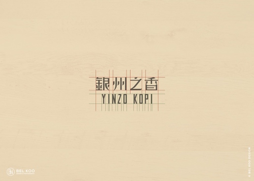
One of her projects which I like the most is Yinzo Logo & Visual Identity Design project. This is a project about designing the logo & visual identity for an oriental and vintage café in Ipoh, Perak, Malaysia. Yinzo Kopi is a Nanyang style café in Ipoh, Perak, Malaysia. With an ambience reminiscing the 80s, they offer local meal such as egg and toast, noodles and Ipoh white coffee. Yinzo situated in a colonial building built in 1920, this establishment celebrates the mix of old and new designs, filled with vintage collectables, exposed bricks walls and original wooden beams.
The meaning of the shop name:
Yin (银) (English: Silver; Malay: Perak)
Zo (州) (English: State; Malay: Negeri)
As evidenced in the above examples, Bell incorporated a lot of elements which has the Nanyang-style cafe vibe in her design so the customers can resonate with the designs well. This project of her also has clearly showcased the essence of Nanyang-style cafe, which in turn makes a very significant Southeast Asia design.
More of her works can be found on:
https://www.dream-design.net/
Exercise.
Research and Idea Development
For our Project 2, we are required to create a self-portrait after conducting research by exploring the city of KL. There are a few spots we can visit, such as Brickfields, Central Market (Pasar Seni), Masjid Jamek and more. My friend and I have chosen to visit the Central Market, however, most of my research which has been conducted for this particular project is from the Ilham Gallery, at the school library, and on my phone, merely some at the Central Market. Hence, more images of research done at Central Market will be seen on the final project post.
While executing this project, we were asked to question ourselves about:
1. Who am I?
2. How has culture affected me?
3. How do others see me?
4. How do I see myself?
I find these questions very interesting as these are not the typical questions we encounter on a daily basis. They are questions which we can use for self-discovery which will help us in identifying who we truly are. I have addressed the answers to these questions in my artwork which will be explained at the end of this post. To begin with, I sketched out a few ideas of mine on my sketchbook. Below are the sketches. I had ideas like asking others to describe me as a movie character, using the Johari Window to describe myself and more. But the composition for the above ideas weren't looking great, so I brainstormed more.
All four questions could be answered on my own, however not for the third question. Despite having a rough idea of what others see me, I wanted to be sure of that. Hence, I conducted a short survey among my group of friends and family members through Google Form.
These are the people whom I sent my Google Form to (Fig. 10.10).
The result below shows that most of the people see me as an obedient kid, instead of a rule breaker (Fig. 10.11). That one person who voted me as a rule-breaker, he/she knows what I long to be, lol!
When they were asked to choose between two of the options, 100% of the respondents said that I am an organized person and as if I have OCD (Fig. 10.12).
I made the survey pretty short, as I didn't want to address too many of my personalities on my art, or not the overall composition will look too messy. Here are some comments the respondents left upon completion of the survey.
Now with even more solid evidence, I was sure of the sketch I made in Fig. 10.9 and hence proceeded with the idea.
Aside from this, I also drew inspirations and conducted some other research for this project. The background was inspired by the legal books I saw on the 3rd floor of Taylor's Library (Fig. 10.15).
As for the animal, I chose to use a sheep to represent me because it's said that sheep is an obedient, and loving animal, which I find very relevant! The link which I used for my research is: https://mydreamsymbolism.com/sheep-spirit-animal-totem-symbolism-and-meaning/
I also did some research on colours to find out about which suits me the meaning I want to bring out the best on https://graf1x.com/color-psychology-emotion-meaning-poster/
Inspirations were also drawn during my visit to Ilham Gallery and Central Market. I was inspired to create a black and white portrait by these beautiful work I saw at the Ilham Gallery because I think it can bring out a lot of emotions (Fig. 10.16 and 10.17).
While visiting the area around Central Market, I stumbled upon a shop in Chinatown which displays a series of celebrities' portrait (Fig. 10.18).
There are a few shops in the Central Market that offer portrait drawing service (Fig. 10.20).
Besides, I also check out some artists' work on Instagram and Pinterest.
Process
I didn't have an image of me hugging a sheep so I asked for my mom's help to snap a picture of me, hugging my backpack.
To begin with, I sketched out the outline of my face and the background on an A4 paper.
I then drew my facial features in detailed.
I wanted to use a different method to present the sheep so I bought some cotton balls to be used as the sheep's wool. It's now a 3D artwork!
Among life's big questions, the one that is often pondered by mankind is no other than who am I? To me, who I am today is not solely based self-perception, but also others' perception of us, cultural influences, etc. Because external influences surely have the power to mould us into who we are today.
To find out others' perception of me, I conducted a short survey among my friends and family members. Out of 13 respondents, 12 respondents voted that I am an obedient kid, while 1 person voted that I am a rule-breaker. In another question, 13 respondents voted me as an organized person, and it's as if I have OCD. The interesting thing is that these are not merely others' perception of me, because I see these in myself too.
With the results attainted, I transferred them visually to my art, by depicting my obedient and organized behaviour with illustrations of legal books.
However, these two characteristics of mine seem to do more harm than good to me.
We live in a society where success culture is highly encouraged and celebrated. However, sometimes it is believed that one has to "suffer" to achieve greater heights. Yes, we should expect sacrifices to be made, but we should not neglect our health, be it physical or mental, during our journey of acquiring success.
All this while, I believed that I should be serious and not play around; be obedient in following the rules; be someone who gives my all out when I am on my journey in achieving what I want. However, I find this to be taking a toll on myself, on my physical and mental health. All these rules, they gradually transformed into prison bars, limiting myself to explore more, to break the rules, to be... free.
Deep down, I know that they are a flock of sheep in me, wanting to escape from the limitations and soar in the sky. But I know for sure that it will be difficult because the ear tag I have on my sheep ear, says that I am bounded; the wings I have, is merely a pair of invisible wings.
But I have a dream, to be alive and free,
and I believe the only person who is holding myself back, is me.
So may all of the boundaries flow away like watercolour,
and the wings be visible,
and by then,
I get to be myself again.
This is my very first portrait,
but I hope it won't be my last.
Design principles applied:
1. Repetition and pattern: The repetitive patterns of legal books.
2. Lines and dots: Lines and dots are used for the human face and body.
3. Harmony in unity: The same size of legal books and colours from each row of the shelf shows harmony in unity.
4. Harmony in variety: The variety in the colour of the legal books and the variety in the year on the legal books show harmony in variety.
5. Texture: Different textures are used, such as watercolour texture, pen texture, cotton ball texture.
Feedback.
Miss Sherry likes how I made the sheep in 3D and a few of my classmates commented that it's nicely done.
This week, a group of classmates presented about some Southeast Asian designers as well as their contribution to the design industry. Some of the designers mentioned during the presentation are:
1. Kiki Poh: Malaysia's first Pixar artist
2. Yohanes Raymond: Indonesian's award-winning independent graphic designer
3. Muid Latif: Malaysia's graphic designer, web designer, and digital artist
4. Datuk Mohammad Nor bin Mohammad Khalid (aka Lat): Malaysia's award-winning cartoonist
Here are some other Southeast Asian designers I found online after the presentation:
1. Gary Chew
Gary Chew is an expert in branding, graphic and web design, as well as packaging design. While he works in Singapore, Gary was born and raised in Malaysia. His dominance as a graphic designer is established with big brand projects like Himalaya, Sony, and Vivdiaa under his belt.
Upon completing his O-levels at Poi Lam high school, Gary pursued a diploma in Graphic Design at Perak Institute of Arts in 2002 for 3 years. With his academic credentials, he worked as a junior designer at Polymould Graphic Sdn Bhd from (2006-2007), a senior designer at Imagewerks (2007-2008), an art director at Idealwoorks (2008-2015) and now, a freelance designer.
 |
| Fig. 10.1 Gary's personal branding logo |
Being a monogram lover, he created his personal branding logo by overlapping his initial, "G" and "C" to form a monogram. The overall view is a "G" where the "C" is positioned in the negative space. For his personal promotional items, Gary intended to create something which has an organic feel and unusual and appears to be memorable to others at the same time. Hence, he created his promotional items based on the sewing brand label. Below are some examples of his promotional items (Fig. 10.2).
 |
| Fig. 10.2 Gary's promotional items |
Aside from that, Gary also designs logos and now has a few collections of it. His logo designs have showcased traits of Southeast Asian designs by incorporating cultural elements in his designs. Below is an example of including an image of a Vietnamese lady in a bowl of Pho, a popular street food in Vietnam (Fig. 10.3).
 |
| Fig. 10.3 Logo design for Vnam Kitchen |
More of his works can be found on:
http://www.garychew.net/
https://www.behance.net/garychew
2. Bel Koo
Bel Koo is a titan in designing websites, brands, and wedding material. With the guiding principle, “beautify your brand, web, and wedding stationery.”
Bel Koo, a Malaysia based Creative Graphic/Web Designer and Photographer; diploma in Graphic Design (PIA College – Perak Institute of Art). Since 2006, Bel Koo Design has been providing Logo Design, Brand Identity Design, Website Design, Wedding Stationery Design and Photography services for profession, corporate and the wedding couples. She also had a worldwide client roster and her work is featured in design related gallery, publications and exhibition.
Bel Koo has accumulated multiple awards like the A’Design Award and Competition in Italy and has been featured in ArtMAX Magazine, CUTOUT, and the CTA Exhibition. She is most proud of her designs that portray bold elegance. She also does amazing photography in a style that plays with contrast.
One of her projects which I like the most is Yinzo Logo & Visual Identity Design project. This is a project about designing the logo & visual identity for an oriental and vintage café in Ipoh, Perak, Malaysia. Yinzo Kopi is a Nanyang style café in Ipoh, Perak, Malaysia. With an ambience reminiscing the 80s, they offer local meal such as egg and toast, noodles and Ipoh white coffee. Yinzo situated in a colonial building built in 1920, this establishment celebrates the mix of old and new designs, filled with vintage collectables, exposed bricks walls and original wooden beams.
The meaning of the shop name:
Yin (银) (English: Silver; Malay: Perak)
Zo (州) (English: State; Malay: Negeri)
 |
| Fig. 10.4 Logo design |
 |
| Fig. 10.5 Typography on logo design |
 |
| Fig. 10.6 Menu design |
As evidenced in the above examples, Bell incorporated a lot of elements which has the Nanyang-style cafe vibe in her design so the customers can resonate with the designs well. This project of her also has clearly showcased the essence of Nanyang-style cafe, which in turn makes a very significant Southeast Asia design.
More of her works can be found on:
https://www.dream-design.net/
Exercise.
Research and Idea Development
For our Project 2, we are required to create a self-portrait after conducting research by exploring the city of KL. There are a few spots we can visit, such as Brickfields, Central Market (Pasar Seni), Masjid Jamek and more. My friend and I have chosen to visit the Central Market, however, most of my research which has been conducted for this particular project is from the Ilham Gallery, at the school library, and on my phone, merely some at the Central Market. Hence, more images of research done at Central Market will be seen on the final project post.
While executing this project, we were asked to question ourselves about:
1. Who am I?
2. How has culture affected me?
3. How do others see me?
4. How do I see myself?
I find these questions very interesting as these are not the typical questions we encounter on a daily basis. They are questions which we can use for self-discovery which will help us in identifying who we truly are. I have addressed the answers to these questions in my artwork which will be explained at the end of this post. To begin with, I sketched out a few ideas of mine on my sketchbook. Below are the sketches. I had ideas like asking others to describe me as a movie character, using the Johari Window to describe myself and more. But the composition for the above ideas weren't looking great, so I brainstormed more.
 |
| Fig. 10.7 Sketch #1 |
 |
| Fig. 10.8 Sketch #2 |
 |
| Fig. 10.9 Sketch #3 |
These are the people whom I sent my Google Form to (Fig. 10.10).
 |
| Fig. 10.10 Target audience for this survey |
The result below shows that most of the people see me as an obedient kid, instead of a rule breaker (Fig. 10.11). That one person who voted me as a rule-breaker, he/she knows what I long to be, lol!
 |
| Fig. 10.11 Others' perception of me #1 |
When they were asked to choose between two of the options, 100% of the respondents said that I am an organized person and as if I have OCD (Fig. 10.12).
 |
| Fig. 10.12 Others' perception of me #2 |
I made the survey pretty short, as I didn't want to address too many of my personalities on my art, or not the overall composition will look too messy. Here are some comments the respondents left upon completion of the survey.
 |
| Fig. 10.13 Comments #1 |
 |
| Fig. 10.14 Comments #2 |
Now with even more solid evidence, I was sure of the sketch I made in Fig. 10.9 and hence proceeded with the idea.
Aside from this, I also drew inspirations and conducted some other research for this project. The background was inspired by the legal books I saw on the 3rd floor of Taylor's Library (Fig. 10.15).
 |
| Fig. 10.15 Legal books |
As for the animal, I chose to use a sheep to represent me because it's said that sheep is an obedient, and loving animal, which I find very relevant! The link which I used for my research is: https://mydreamsymbolism.com/sheep-spirit-animal-totem-symbolism-and-meaning/
I also did some research on colours to find out about which suits me the meaning I want to bring out the best on https://graf1x.com/color-psychology-emotion-meaning-poster/
Inspirations were also drawn during my visit to Ilham Gallery and Central Market. I was inspired to create a black and white portrait by these beautiful work I saw at the Ilham Gallery because I think it can bring out a lot of emotions (Fig. 10.16 and 10.17).
 |
| Fig. 10.16 Tim Franco's Holy Night Girl |
 |
| Fig. 10.17 Figure 5. Secret of Love No.3 (2017) by Thanathorn Suppakijjumnong; Typing on paper, folded paper on canvas frame; 120cm x 90cm |
While visiting the area around Central Market, I stumbled upon a shop in Chinatown which displays a series of celebrities' portrait (Fig. 10.18).
 |
| Fig. 10.18 Portraits of celebrities |
There are a few shops in the Central Market that offer portrait drawing service (Fig. 10.20).
 |
| Fig. 10.19 Central Market |
 |
| Fig. 10.20 Portrait drawing service |
Besides, I also check out some artists' work on Instagram and Pinterest.
 |
| Fig. 10.21 Frida Karlo Parrots |
 |
| Fig. 10.22 Ana Santos's Illustration |
 |
| Fig. 10.23 Rccoo's self-portrait |
Process
I didn't have an image of me hugging a sheep so I asked for my mom's help to snap a picture of me, hugging my backpack.
 |
| Fig. 10.24 Step 1: Image used |
To begin with, I sketched out the outline of my face and the background on an A4 paper.
 |
| Fig. 10.25 Step 2: Sketching |
Then, I cut the figure out to be traced on a watercolour paper.
 |
| Fig. 10.25 Step 3: Cutting |
I then drew my facial features in detailed.
 |
| Fig. 10.26 Step 4: Facial features |
 |
| Fig. 10.27 Step 5: Completed the outline and details |
The working in progress pictures attached below shows my watercoloring process.
 |
| Fig. 10.28 Step 6: Coloring the legal books |
 |
| Fig. 10.29 Step 7: Coloring the spaces between prison bars and bookshelf |
 |
| Fig. 10.30 Step 8: Coloring my shirt and the sheep ear tag |
 |
| Fig. 10.31 Step 9: Coloring the prison bars |
 |
| Fig. 10.32 Step 10: Coloring the prison bars |
 |
| Fig. 10.33 Step 11: Drawing my face with a pen and adding the years on the legal books |
 |
| Fig. 10.34 Step 12: Adding a wing to the sheep |
I wanted to use a different method to present the sheep so I bought some cotton balls to be used as the sheep's wool. It's now a 3D artwork!
 |
| Fig. 10.35 Step 13: Adding cotton balls on sheep |
Below is the final outcome of my Project 2: Self-portrait.  |
| Fig. 10.36 My final outcome |
Rationale
Among life's big questions, the one that is often pondered by mankind is no other than who am I? To me, who I am today is not solely based self-perception, but also others' perception of us, cultural influences, etc. Because external influences surely have the power to mould us into who we are today.
To find out others' perception of me, I conducted a short survey among my friends and family members. Out of 13 respondents, 12 respondents voted that I am an obedient kid, while 1 person voted that I am a rule-breaker. In another question, 13 respondents voted me as an organized person, and it's as if I have OCD. The interesting thing is that these are not merely others' perception of me, because I see these in myself too.
With the results attainted, I transferred them visually to my art, by depicting my obedient and organized behaviour with illustrations of legal books.
However, these two characteristics of mine seem to do more harm than good to me.
We live in a society where success culture is highly encouraged and celebrated. However, sometimes it is believed that one has to "suffer" to achieve greater heights. Yes, we should expect sacrifices to be made, but we should not neglect our health, be it physical or mental, during our journey of acquiring success.
All this while, I believed that I should be serious and not play around; be obedient in following the rules; be someone who gives my all out when I am on my journey in achieving what I want. However, I find this to be taking a toll on myself, on my physical and mental health. All these rules, they gradually transformed into prison bars, limiting myself to explore more, to break the rules, to be... free.
Deep down, I know that they are a flock of sheep in me, wanting to escape from the limitations and soar in the sky. But I know for sure that it will be difficult because the ear tag I have on my sheep ear, says that I am bounded; the wings I have, is merely a pair of invisible wings.
But I have a dream, to be alive and free,
and I believe the only person who is holding myself back, is me.
So may all of the boundaries flow away like watercolour,
and the wings be visible,
and by then,
I get to be myself again.
This is my very first portrait,
but I hope it won't be my last.
Design principles applied:
1. Repetition and pattern: The repetitive patterns of legal books.
2. Lines and dots: Lines and dots are used for the human face and body.
3. Harmony in unity: The same size of legal books and colours from each row of the shelf shows harmony in unity.
4. Harmony in variety: The variety in the colour of the legal books and the variety in the year on the legal books show harmony in variety.
5. Texture: Different textures are used, such as watercolour texture, pen texture, cotton ball texture.
Feedback.
Miss Sherry likes how I made the sheep in 3D and a few of my classmates commented that it's nicely done.
Week 9 (24/10/19): A Visit to Ilham Gallery
As a part of our research for Project 2 and Final Project, we paid a visit to Ilham Gallery at Ampang Park on 24th October 2019. My friends and I made our way there by Grab which took us less than an hour to arrive.Upon arrival, we took the lift and went all the way up to the 5th floor for an art exhibition with the theme "Fracture and Fiction". This exhibition showcases artworks from a variety of Southeast Asia and South Asia designers which were created based on their response towards current or past social issues. Below are a few images I took at the art gallery.
 |
| Fig. 9.1 The Follower (2002) by Mella Jaarsma; Embroidered emblems; 150cm x 40cm |
I saw this art rather interesting, as it is made up of badges from schools, political parties, churches and companies from all corners of the Indonesian archipelago. All these badges formed a jilbab, a long outer garment worn by Indonesian Muslim women. The garment represents shelter, protection and belief communication. Through this piece, Mella intends to communicate the multicultural facets of Indonesian society.
There are several other art pieces which I found interesting.
 |
| Fig. 9.2 House (above) (2006) and Knowledge (below) (2019) by Tawatchai Puntusawasdi; Crayon on paper and Teak wood; 100cmx100cmx90cm and 99cmx60cmx140cm |
 |
| Fig. 9.3 Pink Man in Paradise (2003) by Manit Sriwanichpoom; C print photograph; 90cmx109.5cm |
 |
| Fig. 9.4 100 Hand-drawn maps of India (2019) by Shila Gupta; Carbon tracings on paper; 157cmx122cm |
 |
| Fig. 9.5 A close-up of 100 Hand-drawn maps of India |
We also visited the photography exhibition on the 3rd floor. Here are some of my favourite portrait photography.
 |
| Fig. 9.6 Goyo (Left) and Holy Night Girl (Right) by Tim Franco |
 |
| Fig. 9.7 Mom (Left) and Dad (Right) by Lauren Forster |
As a reflection of this gallery visit, we were required to document our experience and identify design principles found on art pieces of our choice. Below is my submission for the report. It was a brand new experience for me, as I made a new friend and attempted portrait life sketching hence this report of mine is quite long-winded haha.
Fig. 9.8 Gallery Visit Report (PDF)
Week 9 (21/10/19 - 27/10/19): Symbol, Image, and Words
1. SymbolThe representation of an object through mark, sign, or words.
Examples of Symbols and their meanings
1. Infinity symbol (Fig. 8.1)
The mathematical meaning of the infinity dates back to 1655 when English mathematician John Wallis first used it in his work, “De Sectionibus Conicis.”Wallis did not explain his choice of this symbol, but it’s been thought to be a variant form of a Roman numeral for 1,000 (originally CIƆ, also CƆ), which was sometimes used to mean “many.”
 | |||
| Fig. 8.1 Infinity symbol |
2. Skull and Crossbones (Fig. 8.2)
This notorious symbol consisting of a human skull and two bones crossed underneath originated in the medieval ages when it was used to symbolize death. Later on, it was adopted by pirates who put this symbol on their flags. These days, it is used as a warning label on containers of poisonous or dangerous substances.
 |
| Fig. 8.2 Skull and cross |
The types of symbols
1. Pictorial symbols - Pictorial symbols are pictorial representations, such as ISOTYPE. Pictograms
are iconic signs which represent complex facts, not through words or sounds but through visual carriers of meaning.
Fig. 8.3 below illustrates the symbols of baked goods which replicates the actual images of baked goods. It's simple and straightforward to be understood.
 |
| Fig. 8.3 Pictorial symbols - symbols of baked goods |
2. Functional symbols - Symbols that illustrate actions that are currently taking place.
Fig. 8.4 shows a baseball player playing baseball by illustrating the actions him/her doing so. Spectators would understand what sport is taking place when they look at these symbols since the baseball bat is visible and clearly illustrated.
 |
| Fig. 8.4 Functional symbols - a baseballer |
3. Conceptual symbols - symbols used to represent a feature.
Fig. 8.6 can be understood as a medium of payment which is the feature of this symbol.
 |
| Fig. 8.6 Conceptual symbol - dollar sign symbol |
4. Conventional symbols - symbols which do not have a direct relationship with the element it is representing.
The Omega symbol below (Fig. 8.7) serves its conventional purpose by representing ohm in physics. We would not have understood about this symbol if we do not learn it in prior. In a way, conventional symbols can be comprehended as symbols used for people to remember something instead of expressing it in detail.
 |
| Fig. 8.7 Fig. 8.7 Conventional symbol - ohm symbol |
An image is an artefact that depicts visual perception, such as a photograph or other two-dimensional picture.
Ways to compose a perfect image
There are several ways to compose a perfect image/picture. One of which is by using the rule of thirds.
1. Rule of thirds - The rule of thirds is applied by aligning a subject with the guidelines and their intersection points, placing the horizon on the top or bottom line, or allowing linear features in the image to flow from section to section.
In Fig. 8.8, the lines intersect at the important element of this image, which is the dog, hence drawing the viewers' eyes into the entire composition, instead of merely focusing at the middle of the composition.
 |
| Fig. 8.8 An example of the Rule of Third |
2. Leading lines - leading lines are known as lines that can lead our eyes to a picture. A leading line paves an easy path for the eye to follow through different elements of a photo. Usually, they start at the bottom of the frame and guide the eye upwards and inwards, from the foreground of the image to the background, typically leading toward the main subject.
 |
| Fig. 8.9 An example of leading lines which is the road |
References/ more tips to create a perfect picture composition can be found on the webpage below:
https://www.vice.com/en_us/article/9an3d7/9-tips-for-composing-the-perfect-picture
3. Words/ Typography
The art and technique of arranging type.
The arrangement of type involves selecting:
- typefaces
- point sizes
- line lengths
- line-spacing
- letter-spacing
- and adjusting the space between pairs of letters.
Typefaces
Different typefaces can give different perceptions to the viewers and decides the mood of a composition.
This is evident in the example showed in the wedding invitation in Fig. 8.10. A cursive typeface is used to deliver the classy mood of a wedding. It also shows that it's a rather high-end wedding with the choice of typeface colour, which is gold. However, typographers have to be aware of fancy/cursive typefaces as they might be difficult for viewers to comprehend.
 |
| Fig. 8.10 Cursive typeface used in a wedding invitation |
Layout systems
There are a few layout systems used in Typography. One of which is the radial system. The radial system immediately presents a compositional challenge because each line most readily exists as an individual unit with a relationship only with the focal point. It's an interesting layout, as the viewers will read the sentence from the circle in the middle as it's the focal point.
There are a few layout systems used in Typography. One of which is the radial system. The radial system immediately presents a compositional challenge because each line most readily exists as an individual unit with a relationship only with the focal point. It's an interesting layout, as the viewers will read the sentence from the circle in the middle as it's the focal point.
 |
| Fig. 8.11 Radial system in typography |
References/ more examples of types of layout systems can be found in the links below:
https://visme.co/blog/layout-design/
https://visualdesignfordh.files.wordpress.com/2014/06/grid-systems.pdf
Exercise.
Materials: Photography and Adobe Photoshop
For this exercise, we were required to explore the campus and take photos of our surroundings. We are also given the chance to try out Adobe Photoshop for image enhancement and also digital collage making. Fig. 8.12 shows the photos captured by me during class hours.
 |
| Fig. 8.12 Photos captured by me |
After going through the photos, I decided to enhance a shot of the bamboo structure (Fig. 8.13) made by the Architecture students on Adobe Photoshop. Below are the steps of editing the image (Fig. 8.14-8.27).
 |
| Fig. 8.13 Original image 1 |
 |
| Fig. 8.14 Step 1: Importing the image to Adobe Photoshop |
 |
| Fig. 8.15 Step 2: Adjusting the brightness and contrast of the image |
 |
| Fig. 8.16 Step 3: Choosing a suitable percentage for brightness and contrast |
I wasn't sure about image sharpening on Adobe Photoshop, hence I did some research online to find out about the ways I can sharpen an image differently. I learnt about image sharpening here: https://helpx.adobe.com/photoshop/using/adjusting-image-sharpness-blur.html
 |
| Fig. 8.17 Step 4: Sharpening the image with Smart Sharpen |
 |
| Fig. 8.18 Step 5: Adjusting the 'Amount', 'Radius', and 'Reduce Noise' |
 |
| Fig. 8.19 Step 6: Selecting a part to sharpen |
 |
| Fig. 8.20 Step 7: Adjusting the sharpening of the selected part |
 |
| Fig. 8.21 Step 8: Selecting the background of the picture |
 |
| Fig. 8.22 Step 9: Apply Gaussian blur to the background of the picture |
 |
| Fig. 8.23 Step 10: Adjusting the percentage for Gaussian blur |
 |
| Fig. 8.24 Enlarged part of the sharpened bamboo |
Since the sharpened area of the bamboo looks a little too contrasting with the blurry background, I decided to soften certain areas of it, to make it fused better with the background (Fig. 8.18).
 |
| Fig. 8.25 Step 11: Soften certain areas of the sharpened bamboo |
 |
| Fig. 8.26 Step 12: Adjusting the hue and saturation |
 |
| Fig. 8.27 Step 13: Cloning away some bamboo sticks with the clone stamp for a better composition |
Fig. 8.28 Enhanced image 1 (PDF)
Aside from that, I wanted to experiment with monochromic picture hence I chose another favourite shot of mine (Fig. 8.29) to be edited on Adobe Photoshop. Below are the steps taken to produce a monochromic image (Fig. 8.30-8.32).
 |
| Fig. 8.29 Original image 2 |
 |
| Fig. 8.30 Step 1: Desaturating the image |
 |
| Fig. 8.31 Step 2: Adjusting the hue and saturation |
 |
| Fig. 8.32 Step 3: Adjusting the brightness and contrast |
Below is my final outcome for my second attempt (Fig. 8.33).
Fig. 8.33 Enhanced image 2 (PDF)
There is another photo taken of mine which I think is quite interesting and I wanted to make something out of it. Below is the original image (Fig. 8.34). I love how the angle which the picture was taken at - the statue looks powerful and elegant.
 |
| Fig. 8.34 Original image 3 |
I wasn't sure of what do I want to edit out of this image, but when I stumbled upon the cover of National Geographic magazine (Fig. 8.35), an idea struck my mind: maybe creating a National Geographic cover would be a perfect fit! Below are the steps (Fig. 8.37- 8.41).
 |
| Fig. 8.35 National Geographic magazine as my reference |
 |
| Fig. 8.36 National Geographic magazine as my reference |
 |
| Fig. 8.37 Step 1: Selecting the statue's background inversely |
 |
| Fig. 8.38 Step 2: Adjusting the hue and saturation to 0 for a black background |
 |
| Fig. 8.39 Step 3: Choosing a suitable typeface as the title of the magazine |
 |
| Fig. 8.40 Step 4: Inserting the magazine title PNG found on Google Image |
 |
| Fig. 8.41 Step 5: Inserting the iconic yellow border of National Geographic and other minor details |
And that's it! Below is the final outcome of my third attempt (Fig. 8.42).
Fig. 8.42 Enhanced image 3 (PDF)
In fact, the yellow border is not a mere border for decorating purposes but also symbolizes the logo of National Geographic (Fig. 8.43).
 |
| Fig. 8.43 Logo of National Geographic |
Week 8 (14/10/19 - 20/10/19): Harmony, Rhythm and Movement
Lecture.1. Harmony
Harmony can be described as sameness, the belonging of one thing with another. The repetition of design elements like color, texture, shape, and form is one of the easiest ways to achieve harmony to create a composition.
Types of Harmony
Harmony by Unity- It is achieved when all parts of the design are related to an idea. A sense of wholeness is formed.
 |
| Fig. 7.1 Harmony by unity |
 |
| Fig. 7.2 Harmony by unity in a space |
Harmony by Variety- It is achieved by combining various elements together in a composition. Diversity can be seen through this type of harmony.
 |
| Fig. 7.3 Harmony by variety; variety in the shapes and their colors |
 |
| Fig. 7.3 Harmony by variety; variety in the colors of birds |
Harmony by unity and harmony- It can be achieved when unity and harmony are combined effectively.
 |
| Fig. 7.4 Wassily Kandinsky 'Several Circles'; oil on canvas; 140.3cm x 140.7cm |
In this composition, unity is provided by the repetition of circles on a neutral background. Variety is added by varying the sizes and colors of the circles, and by overlapping them.
2. Rhythm
The principle of design which refers to a regular repetition of elements of art to produce the look and feel of movement.
 |
| Fig. 7.5 An example of rhythm |
Types of Rhythm
1. Regular Rhythm- occurs when the intervals between the elements, and often the elements themselves, are similar in size or length.
2. Random Rhythm- occurs when the grouping of similar elements that repeat with no regularity.
3. Alternating Rhythm- occurs when there is more than one repetition of elements.
4. Flowing Rhythm- occurs when the pattern curves and undulates.
5. Progressive Rhythm- occurs when there is a gradual increase or decrease in the size, number, color or some other qualities.
The path our eyes follows through an artwork.
 |
| Fig. 7.6 An example of movement |
Ways to Create Movement
1. Rhythm
2. Lines
3. Colors
4. Illusions
Exercise.
Materials: collage materials
While flipping through the IKEA magazine, I realized there is a repetition of colors of pages and this sparked an idea in my mind, which is to use adjacent color tones to create a harmonious effect on my collage work.
To have a rough idea of how can I work on it, I searched up Pinterest for ideas. Below are my findings (Fig. 7.8, 7.9).
 |
| Fig. 7.8 Inspiration 1 |
 |
| Fig. 7.9 Inspiration 2 |
I didn't have an idea of what elements should I include in my collage, but I knew brown is the color I wanted to use as the theme for this exercise, hence I went through the magazine again, to find pages in brown. Below are the pages and elements I found which suit my theme (Fig. 7.10).
 |
| Fig. 7.10 Pages and elements for the brown theme |
Then, I filtered the pages again and came up with a sketch with four chosen pages (Fig. 7.11).
 |
| Fig. 7.11 Sketch |
With the sketch, I cut them out and pasted them on an A4 paper (Fig. 7.12).
 |
| Fig. 7.12 Placement of pages in an A4 paper |
Based on my sketch, this would be the final artwork for the collage exercise but I thought I can add more interesting elements to it for enhancement. Therefore, I cut out some foxes from a wrapping paper and pasted them on it (Fig. 7.13).
 |
| Fig. 7.13 With foxes |
I also wanted to experiment with the human figures I found earlier and see how would my artwork look like with them on. Hence, the below figure (Fig. 7.14). Little did I know that this human figure showed another design principle: rhythm. Rhythm is created with the position of the foxes, which is from bottom to top, along an oblique direction. The hand of the woman also aided in the formation of rhythm. The position of the foxes was altered to create a better rhythm.
 |
| Fig. 7.14 With human figure |
I also added another figure to my collage piece to cover a line of text which I find very distracting. The human figure is pasted on a piece of paper with a lighter tone to provide emphasis to it (Fig. 7.15).
 |
| Fig. 7.15 Another human figure |
Below is the final outcome of my collage work (Fig. 7.16).
 |
| Fig. 7.16 Final outcome (1) |
About my work:
1. Harmony by Unity
- A color theme is chosen for this artwork and adjacent colors are used to show harmony in unity.
- Pictures of similar body parts are used, such as hands and legs.
- Foxes with the same color.
2. Harmony by Variety
- There is a variety of elements used in this artwork, such as kitchen utensils, tables, foxes.
- Pictures of body parts with different positions.
- Foxes with different sitting positions.
3. Rhythm
- Rhythm is created with the position of the foxes, which is from bottom to top, along an oblique direction.
- The hand of the woman also aided in the formation of rhythm.
However, I thought it looked rather cramped with various elements hence I attempted it again, with a different color as its theme and a simpler look. Once again, I flipped through the IKEA magazine, and determine my next color: yellow. I found a few yellow pages (Fig. 7.17) and sketched out my idea (Fig. 7.18).
 |
| Fig. 7.17 Yellow pages |
 |
| Fig. 7.18 Sketch |
This time, I used an ochre background to better suit the yellow theme (Fig. 7.19).
 |
| Fig. 7. 19 Ochre colored paper as the background |
 |
| Fig. 7.20 First element: jug |
 |
| Fig. 7.21 Second element: shoe |
I found another yellow page with a lady hugging pillows (Fig. 7.22) and I think it's adorable to include it in my artwork.
 |
| Fig. 7.22 Cutting out a lady hugging pillows |
I also added some ochre-colored papers with lines of text (Fig. 7.23).
 |
| Fig. 7.23 Third and fourth element: lady and ochre-colored text |
Papers of other colors are also added to my collage work (Fig. 7.24).
 |
| Fig. 7.24 Fifth element: papers of other colors |
Then, stripes of lines (Fig. 7.25).
 |
| Fig. 7.25 Sixth element: stripes of lines |
I also found a red packet with yellow chicks on it (Fig. 7.26), which I cut out later to add to my work.
 |
| Fig. 7.26 A red packet |
Below is the final outcome of my second attempt at collage (Fig. 7.27).
 |
| Fig. 7.27 Final outcome (2) |
About my work:
1. Harmony by Unity
- A color theme is chosen for this artwork and adjacent colors are used to show harmony in unity.
- Chicks of the same color: yellow.
2. Harmony by Variety
- There is a variety of elements used in this artwork, such as jug, shoe, lady, chicks.
- Chicks with different poses.
- Stripes of lines with different colors.
3. Movement
- Movement is created with the flow of yellow liquid being poured into the boot.
Feedback.
Miss Sherry said both compositions are interesting and a lot of things are happening there. She said she thinks I enjoyed the process of creating a collage as well.
Week 7 (07/10/19 - 13/10/19): Dots, Lines, Scale, Size
Lecture.
1. Dots
1. Dots
The most fundamental element in a design. According to Bradley (2010), "the defining characteristic of a dot is that it’s a point of focused attention. Dots anchor themselves in space and provide a reference point relative to the other forms and space around it. While we often think of dots as circular in nature, they don’t have to be. What they are is points of focused attention. Dots are the focal points in our compositions."
The relationship between dots and dots
When two dots are near each other, the emphasis will switch from the relationships of the dot with its surrounding space to the relationship and interaction between dot and dot. This is because when the distance decreases, the tension between them will increase (Fig. 6.1 middle image).
One dot overlapping another creates a figure/ground relationship. One dot is now in the foreground and the other is pushed into the background. Overlapping dots form more complex shapes than either of the individual dots. This resulting cluster of dots is in itself a new dot with a different form (Fig. 6.1 most right image).
 |
| Fig. 6.1 Dots |
(Reference: https://vanseodesign.com/web-design/points-dots-lines/)
Pointillism
In fine art, the term "pointillism" (from the French word "point" meaning "dot") describes a technique of Neo-Impressionism painting. This can be achieved with hundreds of small dots or dashes of pure and unmixed color directly onto the picture.
Below are some examples of a Filipino pointillist, Bea Alcala’s pointillist paintings.
 |
| Fig. 6.2 Bea Alcala, ‘Mahogany’, 2018, acrylic on canvas, 12 x 18 in. Image courtesy Tin-aw Art Gallery. |
 |
| Fig. 6.3 Bea Alcala, ‘Dahlia 2’, 2018, acrylic on canvas, 48 x 72 in. Image courtesy Tin-aw Art Gallery. |
 |
| Fig. 6.4 Cover design by Wang Zhi-Hong |
Aside from fine art, pointillism can also be seen on other types of designs, for instance, book cover. The Pillow Book included lists of all kinds, personal thoughts, interesting events in court, poetry, and some opinions on Wang Zhi-Hong's contemporaries. The dots represented her inner thoughts, feelings expressed through literature.
A line is formed when dots are connected to each other. It is also defined as a continuous movement of a point along the surface. When used right, it is able to convey:
- Focus
- Emphasis
- A sense of direction
- Emotion
- A divide of space
Line Variations
Variations of lines are important as different kinds of lines convey different purposes. With lines, shapes can be formed, and with that focus can be created. Feelings and states of minds can be conveyed through variations of lines as well. Ormsbee Simmonds, in his book, Landscape Architecture, describe what he called mood lines, and how different line personalities
provide different emotions to intended audiences.
 |
| Fig. 6.5 Landscape Architecture |
Below are some examples of how lines can be incorporated in designs (Fig. 6.6).
 |
| Fig. 6.6 Malika Favre's Hike and Seek |
Direction and focus can be created with lines too, as shown in the figures below.
 |
| Fig. 6.7 Focus created with lines |
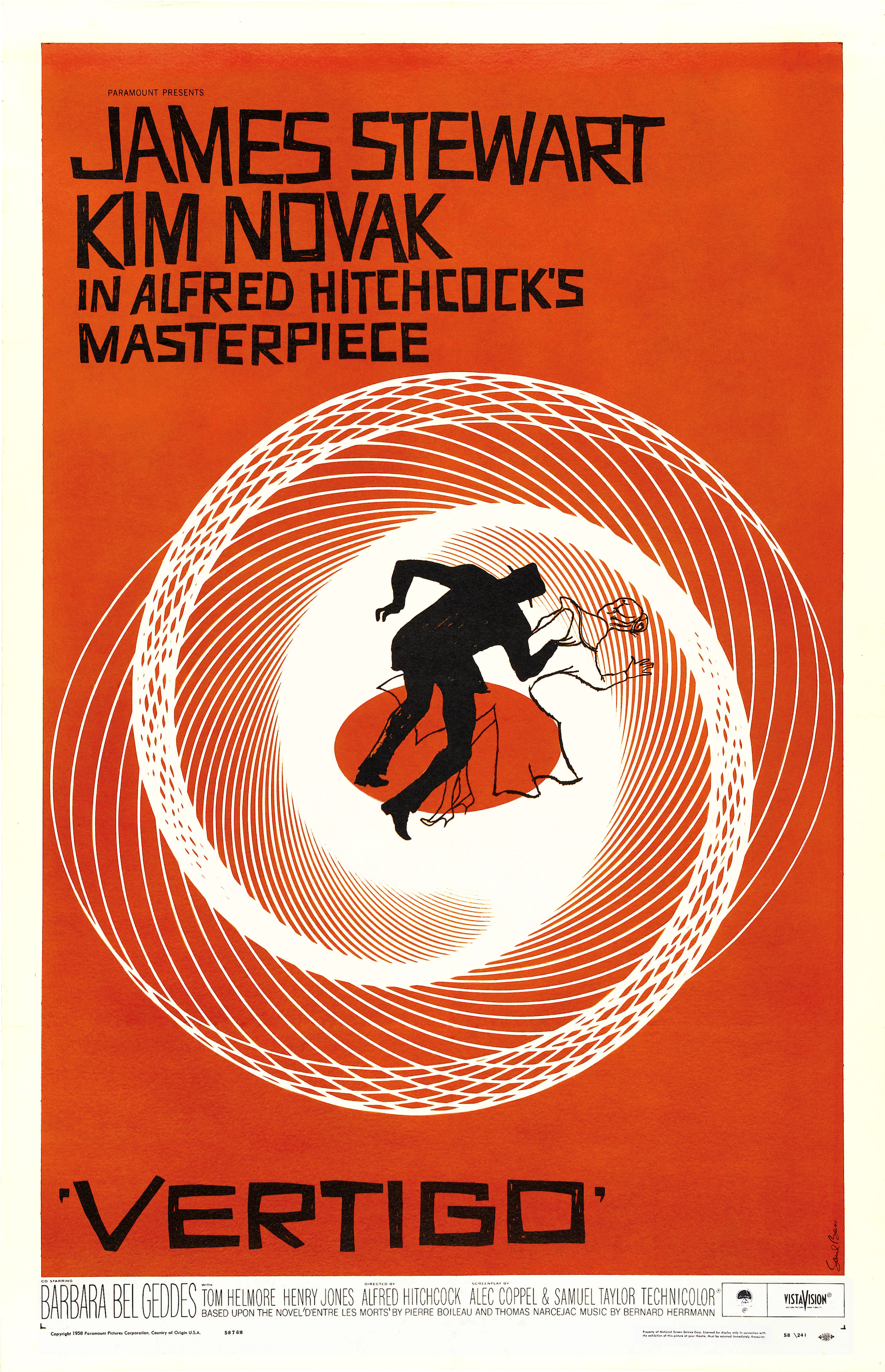 |
| Fig. 6.8 Direction created with lines |
(Reference: https://oss.adm.ntu.edu.sg/chua0850/dot-line-shape/)
3. Scale
According to Walgrove(n.d.), "scale refers to the relative size of a design element in comparison to another element". As designer Steven Bradley wrote, “A single object has no scale until it’s seen in comparison with something else.”
How can scale be used?
It can be used to tell a story, create a visual journey, and portray rhythm and movement. Objects of the same size will make viewers focus on their similarities; if one object is bigger than the other, we may start to consider status, tension, and sequence. On the other hand, playful use of scale can build whimsical or surreal scenes.
Scale can also be used to shift perspective and create a depth of field.
 |
| Fig. 6.9 An example of how scale is used |
This Coca-Cola ad (Fig. 6.9), for example, uses scale to create a smile out of soda bottles. If the bottles were all the same size, this ad would look quite different. By using a scale, however, the brand was able to turn over 20 versions of the same graphic into a new image that effectively conveys its campaign message: “open happiness.”
Exercise.
Materials: pens, pencil
While I was scrolling through my phone gallery for some inspiration, I stumbled upon a picture of me taken by my sister (Fig. 6.10). And I found this picture very relatable to the topic taught today, as I noticed there are both lines and dots on the curtain.
I also drew inspiration from some Pinterest images as shown below.
 |
| Fig. 6.10 A picture of me, also my reference picture |
I also drew inspiration from some Pinterest images as shown below.
 |
| Fig. 6.11 Inspiration 1 |
![[NSFW] Erotic Nudes Emerge from 3D Optical Illusion Drawings - Creators](https://i.pinimg.com/564x/60/d0/17/60d017bf0150be70ea3e81f32bfb5eec.jpg) |
| Fig. 6.12 Inspiration 2 |
Below are the materials used in this exercise (Fig. 6.13).
 |
| Fig. 13 Materials used |
As usual, I started off this exercise with a sketch (Fig. 6.14). I also sketched out some other ideas on my mind.
 |
| Fig. 6.15 Brainstorming session |
After deciding on what I am going to work on, I started off by drawing the outline of my figure (Fig. 6.16).
 |
| Fig. 6.16 Outline of my figure |
Then, I drew the lines of the curtains as well as drawing lines across my face with a pencil (Fig. 6.17 and Fig. 6.18).
 |
| Fig. 6.17 Pencil outline (1) |
 |
| Fig. 6.18 Pencil outline (2) |
Once I am done with the pencil outline, I proceeded with outlining the figure with pen (Fig. 6.19 and Fig. 6.20).
 |
| Fig. 6.19 Pen outline (1) |
 |
| Fig. 6.20 Pen outline (2) |
 |
| Fig. 6.21 With shading (1) |
 |
| Fig. 6.22 With shading (2) |
Below is the final artwork (Fig. 6.23).
 |
| Fig. 6.23 My final outcome of this exercise |
About my work:
This time, I decided to use my picture as the reference picture because it's one of my favorite pictures of myself.
Vertical lines are utilized to create the curtains, hair, and shirt, whereas horizontal lines are used to display the face features. Dots are also seen on the curtains to differentiate the human figure from the background, as they are both formed with vertical lines. Shading with lines is used to provide emphasis on the human figure.
Feedback.
Miss Sherry commented that it's a nice one and that I must have invested a lot of time in creating this artwork.
Week 6 (30/09/19 - 06/10/19): Alignment, Hierarchy, Direction, Perspective
Lecture.
1. Alignment
- the arrangement of visual elements in a straight line or in corrective relative positions.
- alignment is important because it:
- creates a visual connection between related elements
- allows one to arrange elements in a way that matches how people naturally scan the page
1. Alignment
- the arrangement of visual elements in a straight line or in corrective relative positions.
- alignment is important because it:
- creates a visual connection between related elements
- allows one to arrange elements in a way that matches how people naturally scan the page
- there are two types of alignment, namely:
1. Edge alignment: the placement of content on the edges of the page (Fig. 5.1).
 |
| Fig. 5.1 A few examples of edge alignment |
 |
| Fig. 5.2 The text above is left-aligned |
2. Center alignment: the placement of elements on the center axis (Fig. 5.3).
 |
| Fig. 5.3 Examples of center alignment |
 |
| Fig. 5.4 The planets are center-aligned |
- A good alignment is displayed when visual elements are aligned in an orderly manner. It will result in a clear and formal composition (Fig. 5.5).
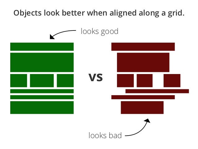 |
| Fig. 5.5 The difference between a good and a bad alignment |
3. Mixed alignment: the usage of one and more alignment (Fig. 5.6).
 |
| Fig. 5.6 Edge and center alignment are seen in the poster above |
4. Simple vs Complex alignment
- A grid can create various types of alignments, two of which are simple alignment and complex alignment (Fig. 5.7 and 5.8).
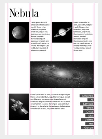 |
| Fig. 5.7 A simple alignment |
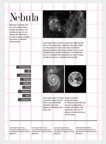 |
| Fig. 5.8 A complex alignment |
2. Hierarchy
- the arrangement of elements in a way that implies importance.
- The importance of hierarchy:
- adds structure to a composition
- provides emphasis to certain elements of a picture
- hierarchy can be displayed in various forms, such as:
1. Hierarchy in scale: the size of the object that wants to be given emphasis will be the largest (Fig. 5.9).
 |
| Fig. 5.9 Maestà (1311), the altarpiece of the Siena cathedral, by Duccio di Buoninsegna |
2. Hierarchy in color: Different colors will symbolize different hierarchy structures. By changing colors, we will change the hierarchy structure as well (Fig. 5.10).
 |
| Fig. 5.10 Towers of a different color has a different hierarchy structure |
3. Hierarchy in contrast: the elements on the inside are darker in color, which creates a contrast, thus is perceived as more important (Fig. 5.11).
 |
| Fig. 5.11 The wine red golf ball is given more emphasis as compared to others |
4. Hierarchy in space: this can be achieved through the overlapping of elements. The elements at the front will appear closer and clearer to us, hence creating a visual hierarchy (Fig. 5.12).
 |
| Fig. 5.12 FISHERMEN (1992) by Khalil Ibrahim; Acrylic on canvas; 101cm x 123cm |
5. Hierarchy in depth: this is achieved through the incorporation of blurry effects to create an illusion of depth (Fig. 5.13).
 |
| Fig. 5.13 Drum and Drummer 17 (2010) by Voon Kim Cheong; oil on canvas; 127cm x 152.5cm |
6. Hierarchy in perspective: The flow of hierarchy starts from the front and moves to the back (Fig. 5.14).
 |
| Fig. 5.14 Marketplace In Luang Prabang by Sompaseuth Chounlamany |
3. Direction
- it is a basic element in design which guides viewers' eyes from one point to another.
- there are three types of direction, namely:
1. Horizontal direction: the direction from left to right and vice versa (Fig. 5.15).
 | |||
| Fig. 5.15 Horizontal Again by Sarah Gayle Carter; oil on hardboard panel; 50.8cm x 101.6cm |
2. Vertical direction: the direction from up to bottom and vice versa (Fig. 5.16).
2. Color: the brightness of the elements decreases with distance (Fig. 5.24).
Exercise.
For this exercise, I wanted to recreate Katsushika Hokusai's The Great Wave off Kanagawa (Fig. 5.24).
My aim in recreating this masterpiece is to give more emphasis on the color difference of the waves. Below are the recyclable materials I prepared for this exercise (Fig. 5.25).
To start with, I sketched out how am I going to apply some principles in it (Fig. 5.26).
Then, I came up with two outline sketches of The Great Wave off Kanagawa. One would be for me to paste the blue part of the waves (Fig. 5.27), another, which is a more intricate version, would be for the white part of the waves (Fig. 5.28).
I removed the unwanted parts for both sketches. Below is the cut-out of the second outline sketch (Fig. 5.29).
Unfortunately, I didn't capture the cut-out of the first outline sketch, as I wanted to get right into pasting the waves and forgot to snap a picture. Below is a picture I took while working on it (Fig. 5.30). I utilized the plastic wrapper of the bread for the dark blue, and the bottle wrapper of Pepsi for the waves that are further away. I also added a boat in the midst of chaotic waves.
Then, I added waves in lighter colors to show the flow of hierarchy - the color intensity reduces with distance. A small boat and a mini Mount Fuji are also seen in the middle of lighter color waves, to show the hierarchy in size/scale. I decided to add on some details on the bigger boat to give emphasis on it by pasting some dried leaves and petal - they are the seats on the boat.
The cut-out of the second outline sketch was pasted on the waves. And I touched up the white waves with some newspaper cut-outs. Below is another work in progress picture (Fig. 5.31).
However, I noticed the color of Mount Fuji was a little too dark, hence I removed and replaced it with a Mount Fuji with a lighter color tone. After touching up the waves with a few more newspaper stripes, the below artwork is the final outcome of the remake of Katsushika Hokusai's The Great Wave off Kanagawa (Fig. 5.32).
This is a remake of Katsushika Hokusai's The Great Wave off Kanagawa. I have incorporated a few design principles learned during this week into it, which are:
1. Non-linear perspective:
- Size variation: The size of the waves decreases with distance. A mini Mount Fuji is also added to show a contrast in size.
- Color: The color intensity of the waves decreases with distance. Waves in darker blues are seen at the front, and waves in lighter blues are seen at the back.
- Value: The opacity of newspaper stripes on the white waves decreases by distance.
2. Hierarchy in space:
- The overlapping of the blue waves shows a hierarchy in space. The waves at the front are more visible than the ones further away.
3. Oblique direction:
- The newspaper stripes on the white waves are showing direction diagonally, hence forming oblique direction.
Feedback.
No feedback is given during the class, as I have not finished my work.
Ms. Sherry said my artwork is interesting to look at because it's different from the original artwork.
1. Pattern
the repetition of more than one design - there are 4 types of patterns, namely:
- Meandering: a pattern built on the repetition of an undulating line (Fig. 4.1).
- Branching: a pattern that branches out from a point (Fig. 4.2).
- Spiral: a pattern that winds in a continuous curve (Fig. 4.3).
- Packing and cracking: a pattern where things are packed and started to "crack" (Fig. 4.4).
2. Repetition
- the act of having something to repeat over and over again
- this can help to build a sense of tension and helps viewers to better understand every detail in an artwork.
- there are two types of repetition, namely:
- Regular repetition: arranged orderly (Fig. 4.5).
- Irregular repetition: arranged unevenly (Fig. 4.6).
3. Texture
- the element of art which refers to the way things feel, or look as if you could feel if touched.
- there are 3 types of texture, namely:
- Physical/tactile texture: patterns of variations upon a solid surface (Fig. 4.7).
- Visual/ implied texture: the illustration of having physical texture (Fig. 4.8).
- Hypertexture: the realistic simulated texture produced by adding small distortions across the surface of an object (Fig. 4.9).
Texture in painting
1. Symmetry
- occurs when objects are arranged in the same way on both sides of the axis.
- there are 3 types of symmetry: reflectional symmetry, rotational symmetry, and translational symmetry.
- Reflectional symmetry (Fig. 3.1):
- Rotational symmetry (Fig. 3.2):
- Translational symmetry (Fig. 3.3):
2. Asymmetry
- formed when items arranged on both side of the axis are different (Fig. 3.5).
3. Balance
- equal distribution of objects, texture, and space in a composition (Fig. 3.6).
Exercise.
Material(s): Watercolor
I came up with my sketch on a folded A4 paper (Fig 3.9), and cut out the parts that should be traced (Fig. 3.10).
Here's the traced and scanned version on an A4 art block (Fig. 3.11).
Lecture.
As for our second lecture, we learned about Gestalt. Gestalt principle states that 'the whole is greater than the sum of its parts'. It is a principle where our minds would try to first comprehend the parts, to realizing the whole.
There are a few Gestalt principles designers can make use of in their designs, namely:
1. Similarity (Fig. 2.1)
2. Closure (Fig. 2.2)
5. Figure and Ground (Fig. 2.5)
- our eyes would differentiate an object from its surrounding.
- a shape, form, silhouette, is naturally perceived as figure (object), whereas its surrounding area is the ground (background).
Exercise.
Material(s): black markers and pens
For the second week's exercise, I decided to create something related to one of my favorite animations of Hayao Miyazaki: Spirited Away. Thus I drafted out some ideas of mine (Fig. 2.6).
I also searched up for some inspirations on Pinterest (Fig. 2.7, 2.8, 2,9).
After much consideration, I settled on my design and sketched my first draft (Fig. 3.0).
Below is my final work for Gestalt (Fig. 3.1).
We also got into a group of 4 and chose a design principle to work on, so we can present it in the class. Our group has chosen rhythm/movement/harmony as our design principle, which will utilize collage materials and glue.
Exercise.
Material(s): Black and white paper
 |
| Fig. 5.16 Wells Fargo Center (2012) in Portland, Oregon |
3. Oblique direction: the direction which is diagonal (Fig. 5.17).
 |
| Fig. 5.17 Carré Oblique (2019) by Raymond Guibert; watercolor on paper; 30cm x 30 cm |
4. Perspective
- the art of representing a three-dimensional object on a two-dimensional surface.
- there are two types of perspective, which are:
1. Linear perspective
- this perspective depicts the illusion of depth through lines.
- there are two types of linear perspective, namely:
- One-point perspective: the usage of one vanishing point on a horizontal line to create depth in an image (Fig. 5.18).
 |
| Fig. 5.18 Fall Date by Leonid Afremov; oil painting on canvas, 75cm x 60cm |
- Two-point perspective: the usage of two vanishing points on a horizontal line to create depth in an image (Fig. 5.19).
 |
| Fig. 5.19 Garuda at Wat Phra Kaew, Bangkok, Thailand |
- Three-point perspective: the usage of three vanishing points to create depth in an image (Fig. 5.20).
 |
| Fig. 5.20 Three-point perspective |
- Bird's eye: the third point is below the two other points (Fig. 5.21).
 |
| Fig. 5.21 Bird's eye |
- Worm's eye: the third point is above the two other points (Fig. 5.22).
 |
| Fig. 5.22 Worm's eye |
2. Non-linear perspective
- a technique of depicting volumes and spatial relationships on flat surfaces without lines.
- there are three ways to create non-linear perspectives, which is through:
1. Size variation: the size of the elements decreases with distance (Fig. 5.23).
 |
| Fig. 5.23 Sunset at Shah Alam by Ghafar Bahari; oil painting |
2. Color: the brightness of the elements decreases with distance (Fig. 5.24).
 |
| Fig. 5.24 Vietnamese gemstone painting; watercolor |
3. Value: the value, or opacity, of the elements, decreases with distance (Fig. 5.25).
 |
| Fig. 5.23 Mountains and waters landscape painting from China |
Exercise.
Materials: Recyclable materials
For this exercise, I wanted to recreate Katsushika Hokusai's The Great Wave off Kanagawa (Fig. 5.24).
 | |
|
 |
| Fig. 5.25 Materials |
To start with, I sketched out how am I going to apply some principles in it (Fig. 5.26).
 |
| Fig. 5.26 What's in my mind |
Then, I came up with two outline sketches of The Great Wave off Kanagawa. One would be for me to paste the blue part of the waves (Fig. 5.27), another, which is a more intricate version, would be for the white part of the waves (Fig. 5.28).
 |
| Fig. 5.27 First outline sketch |
 |
| Fig. 5.28 Second outline sketch |
I removed the unwanted parts for both sketches. Below is the cut-out of the second outline sketch (Fig. 5.29).
 |
| Fig. 5.29 Cut-out from the second outline sketch |
Unfortunately, I didn't capture the cut-out of the first outline sketch, as I wanted to get right into pasting the waves and forgot to snap a picture. Below is a picture I took while working on it (Fig. 5.30). I utilized the plastic wrapper of the bread for the dark blue, and the bottle wrapper of Pepsi for the waves that are further away. I also added a boat in the midst of chaotic waves.
 |
| Fig. 5.30 Work in progress |
Then, I added waves in lighter colors to show the flow of hierarchy - the color intensity reduces with distance. A small boat and a mini Mount Fuji are also seen in the middle of lighter color waves, to show the hierarchy in size/scale. I decided to add on some details on the bigger boat to give emphasis on it by pasting some dried leaves and petal - they are the seats on the boat.
The cut-out of the second outline sketch was pasted on the waves. And I touched up the white waves with some newspaper cut-outs. Below is another work in progress picture (Fig. 5.31).
 |
| Fig. 5.31 Work in progress |
However, I noticed the color of Mount Fuji was a little too dark, hence I removed and replaced it with a Mount Fuji with a lighter color tone. After touching up the waves with a few more newspaper stripes, the below artwork is the final outcome of the remake of Katsushika Hokusai's The Great Wave off Kanagawa (Fig. 5.32).
 |
| Fig. 5.32 My final outcome of this exercise |
About my work:
This is a remake of Katsushika Hokusai's The Great Wave off Kanagawa. I have incorporated a few design principles learned during this week into it, which are:
1. Non-linear perspective:
- Size variation: The size of the waves decreases with distance. A mini Mount Fuji is also added to show a contrast in size.
- Color: The color intensity of the waves decreases with distance. Waves in darker blues are seen at the front, and waves in lighter blues are seen at the back.
- Value: The opacity of newspaper stripes on the white waves decreases by distance.
2. Hierarchy in space:
- The overlapping of the blue waves shows a hierarchy in space. The waves at the front are more visible than the ones further away.
3. Oblique direction:
- The newspaper stripes on the white waves are showing direction diagonally, hence forming oblique direction.
Feedback.
No feedback is given during the class, as I have not finished my work.
Ms. Sherry said my artwork is interesting to look at because it's different from the original artwork.
Week 5 (23/09/19 - 29/09/19): Pattern, Repetition, Texture, and Surface
Lecture.1. Pattern
the repetition of more than one design - there are 4 types of patterns, namely:
- Meandering: a pattern built on the repetition of an undulating line (Fig. 4.1).
 |
| Fig. 4.1 An example of a meandering pattern |
- Branching: a pattern that branches out from a point (Fig. 4.2).
 |
| Fig. 4.2 An example of a branching pattern |
- Spiral: a pattern that winds in a continuous curve (Fig. 4.3).
 |
| Fig. 4.3 An example of a spiral pattern |
- Packing and cracking: a pattern where things are packed and started to "crack" (Fig. 4.4).
 |
| Fig. 4.4 An example of packing and cracking |
2. Repetition
- the act of having something to repeat over and over again
- this can help to build a sense of tension and helps viewers to better understand every detail in an artwork.
- there are two types of repetition, namely:
- Regular repetition: arranged orderly (Fig. 4.5).
 |
| Fig. 4.5 An example of a regular repetition pattern |
- Irregular repetition: arranged unevenly (Fig. 4.6).
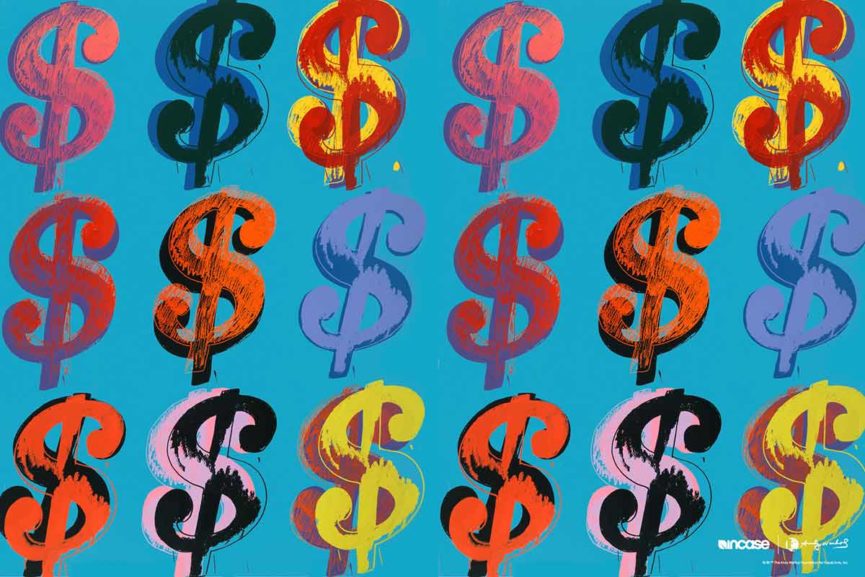 |
| Fig. 4.6 An example of an irregular repetition pattern |
3. Texture
- the element of art which refers to the way things feel, or look as if you could feel if touched.
- there are 3 types of texture, namely:
- Physical/tactile texture: patterns of variations upon a solid surface (Fig. 4.7).
 |
| Fig. 4.7 The veins of the leaf shows patterns upon a solid surface |
 |
| Fig. 4.8 An example of visual texture |
- Hypertexture: the realistic simulated texture produced by adding small distortions across the surface of an object (Fig. 4.9).
 |
| Fig. 4.9 An example of hypertexture |
- there are also different types of textures in painting, such as:
- Actual texture: formed with the heavy build of paint, it is the combination of how the painting looks, and how it feels on while being touched (Fig. 4.10).
 |
| Fig. 4.10 An example of actual texture in painting |
- Abstract texture: the concept of the object is translated in textural patterns, instead of presenting it directly (Fig. 4.11).
 |
| Fig. 4.11 An example of abstract texture |
- Simulated texture: formed when the visual effect of texture is created without adding to it (Fig. 4.12).
 |
| Fig. 4.12 An example of simulated texture |
- Invented texture: an interesting texture created when alternate textures are created (Fig. 4.13).
 |
| Fig. 4.13 An example of an invented texture |
4. Surface
- the top layer of something where any type of artwork is applied on for enhancement of visual appearance and functionality (Fig. 4.14).
Exercise.
Materials: Potato, acrylic, and watercolor
Today's class was different from the previous classes as we had an in-class exercise session. As for the materials, we were assigned to bring vegetables and any items that can be used as stamps for this pattern-making exercise. This time, I decided to use a potato to create a penguin stencil because the penguin is my favorite animal! Below is an image of the materials and tools I used throughout this exercise (Fig. 4.15). I didn't think of using watercolor at the beginning of this exercise, hence it isn't included in the picture below.
First of all, I drew a penguin on an A4 paper and cut it out to be traced on the potato (Fig. 4.16).
After tracing the penguin image on the potato, I removed the unwanted parts with the paper cutter. This step was very effort and time-consuming as there was 'water' coming out from the potato from time to time. However, it was a very fun experience to create my own stencil and felt a sense of accomplishment when looking at the outcome.
With my stencil, I experimented it with both acrylic and watercolor. My first attempt of it with acrylic is shown below (Fig. 4.17).
After experimenting it on some scrap papers, I created a penguin pattern paper as shown in the image below (Fig. 4.18).
I felt that I didn't get the positioning of the penguin right yet, as the penguins are not evenly placed. Therefore, I attempted this pattern-making exercise again. However, I used watercolor as the medium this time as I am curious how will it turn out. Gridlines were also drawn on the second A4 paper for an accurate positioning purpose (Fig. 4.19).
Below is my final outcome at this pattern-making exercise (Fig. 4.20). From what I observed, using watercolor makes the paint to spread more evenly, but tends to make the penguin less sharpened. The wings of penguins in watercolor don't look as sharp as the one created using acrylic. However, this also might be because of the stencil, since it was new and less blunt when I used it with acrylic. I am glad the positioning of the penguins turned out better this time, all thanks to the gridlines.
Inspired by the logo of Penguin Books, I decided to create a penguin stencil from a potato to make a regular repetition pattern of penguins.
Feedback.
Feedback from Ms. Sherry: Ms. Sherry was surprised that I was creating a stencil at first and said I could have just created abstract patterns out of vegetables. Nevertheless, she likes my pattern and finds it interesting. She even found out that blue is one of my favorite colors based on the color of the penguin and the all-blue outfit I wore today.
Feedback from my classmates: I was very overwhelmed by the number of the feedback given to my artwork because I honestly didn't expect to receive 19 feedbacks from my classmates. From the 19 feedback, 5 people complimented me on the neatness of my pattern, which made me feel like the gridlines were worth drawing; 1 person commented I can really do stencil with details on a potato, 1 person even liked my work the most, and the rest complimented on my idea of making a penguin pattern. Aside from compliments, I received constructive criticism as well: the color of the penguins can be more interesting and that I can try to play with colors.
As much as compliments and encouragement are needed, I believe constructive criticism is important too. I see them as inputs from others and suggestions on different ways to improve our artwork, or more importantly, ourselves.
On a side note, I really like the way of giving/receiving feedback from our peers as I regard this as a way of peer learning. It is also a good way for those who are too shy to express their feedback during the critique session. Overall, today's in-class exercise session has benefited me a lot and I can't wait to learn more in the next lesson.
 |
| Fig. 4.14 An example of art printed on several types of surfaces |
Exercise.
Materials: Potato, acrylic, and watercolor
Today's class was different from the previous classes as we had an in-class exercise session. As for the materials, we were assigned to bring vegetables and any items that can be used as stamps for this pattern-making exercise. This time, I decided to use a potato to create a penguin stencil because the penguin is my favorite animal! Below is an image of the materials and tools I used throughout this exercise (Fig. 4.15). I didn't think of using watercolor at the beginning of this exercise, hence it isn't included in the picture below.
 |
| Fig. 4.15 Materials and tools used |
First of all, I drew a penguin on an A4 paper and cut it out to be traced on the potato (Fig. 4.16).
 |
| Fig. 4.16 The cut-out of my penguin |
After tracing the penguin image on the potato, I removed the unwanted parts with the paper cutter. This step was very effort and time-consuming as there was 'water' coming out from the potato from time to time. However, it was a very fun experience to create my own stencil and felt a sense of accomplishment when looking at the outcome.
With my stencil, I experimented it with both acrylic and watercolor. My first attempt of it with acrylic is shown below (Fig. 4.17).
 |
| Fig. 4.17 First attempt with acrylic |
There was also something I found while doing this exercise: it was quite hard to get all the parts of the penguin stamped evenly on the paper due to the uneven surface of my stencil. This shows how one thing can affect another and I will have to take note on that.
 |
| Fig. 4.18 First attempt at this exercise |
 |
| Fig. 4.19 Gridlines on paper |
 |
| Fig. 4.20 Final outcome with watercolor |
About my work:
When I was young, I learned a fact about penguins: the male of the emperor penguins have to guard the eggs and keep them warm for more than 2 months. Each male penguin would incubate an egg, huddled in large colonies with only feathers and fat to keep each other warm. By the time the female penguins returned from the sea, the male penguin may have lost 45 percent of his body weight. They haven't eaten anything except a little snow since they arrived at the colony nearly two months ago and they cannot go out and feed with the egg on their feet.
I find this to be a very selfless act and reckon is the reason why I like penguins since young.
Inspired by the logo of Penguin Books, I decided to create a penguin stencil from a potato to make a regular repetition pattern of penguins.
Feedback.
Feedback from Ms. Sherry: Ms. Sherry was surprised that I was creating a stencil at first and said I could have just created abstract patterns out of vegetables. Nevertheless, she likes my pattern and finds it interesting. She even found out that blue is one of my favorite colors based on the color of the penguin and the all-blue outfit I wore today.
Feedback from my classmates: I was very overwhelmed by the number of the feedback given to my artwork because I honestly didn't expect to receive 19 feedbacks from my classmates. From the 19 feedback, 5 people complimented me on the neatness of my pattern, which made me feel like the gridlines were worth drawing; 1 person commented I can really do stencil with details on a potato, 1 person even liked my work the most, and the rest complimented on my idea of making a penguin pattern. Aside from compliments, I received constructive criticism as well: the color of the penguins can be more interesting and that I can try to play with colors.
As much as compliments and encouragement are needed, I believe constructive criticism is important too. I see them as inputs from others and suggestions on different ways to improve our artwork, or more importantly, ourselves.
On a side note, I really like the way of giving/receiving feedback from our peers as I regard this as a way of peer learning. It is also a good way for those who are too shy to express their feedback during the critique session. Overall, today's in-class exercise session has benefited me a lot and I can't wait to learn more in the next lesson.
Week 3 (09/09/19 - 15/09/19): Symmetry, Asymmetry, Balance, and Contrast
Lecture.1. Symmetry
- occurs when objects are arranged in the same way on both sides of the axis.
- there are 3 types of symmetry: reflectional symmetry, rotational symmetry, and translational symmetry.
- Reflectional symmetry (Fig. 3.1):
 |
| Fig. 3.1 A butterfly which showcases reflectional symmetry |
- Rotational symmetry (Fig. 3.2):
 |
| Fig. 3.2 A starfish which shows rotational symmetry |
- Translational symmetry (Fig. 3.3):
| Fig. 3.3 Translational symmetry |
While Googling examples for symmetry, I found a summary picture of the three types of symmetry, which is very useful in helping me to understand this topic better (Fig. 3.4).
 |
| Fig. 3.4 Summary picture of types of symmetry |
2. Asymmetry
- formed when items arranged on both side of the axis are different (Fig. 3.5).
 |
| Fig. 3.5 'The Great Wave off Kanagawa' |
- equal distribution of objects, texture, and space in a composition (Fig. 3.6).
 |
| Fig. 3.6 'The Creation of Adam' |
Exercise.
Material(s): Watercolor
We were given the chance to pick one out of the 3 topics discussed in class for this week's homework and I decided to give a try on symmetry. This time, I wanted to try out some Chinese architectural designs. Hence, I searched up Pinterest for some inspirations. Below are my findings (Fig. 3.7, 3.8).
 |
| Fig. 3.7 Giant red door |
 |
| Fig. 3.8 Giant red door to the Forbidden City |
I came up with my sketch on a folded A4 paper (Fig 3.9), and cut out the parts that should be traced (Fig. 3.10).
 |
| Fig. 3.9 Sketch on a folded A4 paper |
 |
| Fig. 3.10 After cutting out the parts to be traced |
Here's the traced and scanned version on an A4 art block (Fig. 3.11).
 |
| Fig. Traced and scanned version |
I proceeded with coloring it with watercolor and this is the final result (Fig. 3.12).
 |
| Fig. 3.12 Final result |
About my work:
This is the giant red door to the Forbidden City which showcases reflectional symmetry, as the patterns on both sides of the axis are the same. Rotational symmetry is also present in the gold circles on the door, as well as translational symmetry, on the repetitive patterns of the gold circles.
Feedback.
Ms. Sherry likes the vibrant color of my art piece! She said it looks like a door because of the doorknobs-liked objects present in my work, which is a thing I am glad about, as my work is clear enough to be understood by the audience. To my surprise, Ms. Sherry commented that the door is rather inviting, instead of forbidding people to enter, after I explained that the door is the giant red door to The Forbidden City. She also mentioned that we, as the designers, should be clear on what message we are delivering to the audience. Also, we were reminded to comply with the instructions on materials for our work in the MIB.
Week 2 (02/09/19 - 08/09/19): Gestalt
Lecture.As for our second lecture, we learned about Gestalt. Gestalt principle states that 'the whole is greater than the sum of its parts'. It is a principle where our minds would try to first comprehend the parts, to realizing the whole.
There are a few Gestalt principles designers can make use of in their designs, namely:
1. Similarity (Fig. 2.1)
- this takes place when humans tend to build a relationship between objects that are similar to each other.
- there will be an order of similar objects which creates unity.
 |
Fig. 2.1 Triangles from part of the eagle looks similar to the sun |
2. Closure (Fig. 2.2)
- this happens when an object is incomplete.
- humans' minds will then perceive the whole by filling in the missing parts.
 |
Fig. 2.2 We can still know that it is a panda regardless of its incomplete form |
3. Proximity (Fig. 2.3)
- this occurs when a group of elements is placed together.
- we tend to perceive them as a group.
 |
Fig. 2.3 Gestalt occurs when it is given close proximity between the squares |
4. Continuance (Fig. 2.4)
- our eyes tend to move through one object and continue with another.
 |
Fig. 2.4 The smooth-flowing crossbar of the 'H' leads the eye to the maple leaf |
5. Figure and Ground (Fig. 2.5)
- our eyes would differentiate an object from its surrounding.
- a shape, form, silhouette, is naturally perceived as figure (object), whereas its surrounding area is the ground (background).
 |
| Fig. 2.5 The figure (key) and ground (buildings) |
Exercise.
Material(s): black markers and pens
For the second week's exercise, I decided to create something related to one of my favorite animations of Hayao Miyazaki: Spirited Away. Thus I drafted out some ideas of mine (Fig. 2.6).
 |
| Fig. 2.6 Brainstorming session |
I also searched up for some inspirations on Pinterest (Fig. 2.7, 2.8, 2,9).
 |
| Fig. 2.7 Inspiration 1: silhouettes of the characters |
 |
| Fig. 2.8 Inspiration 2: No face |
 |
| Fig. 2.9 Inspiration 3: question mark |
After much consideration, I settled on my design and sketched my first draft (Fig. 3.0).
 |
| Fig. 3.0 My first draft |
Below is my final work for Gestalt (Fig. 3.1).
 |
| Fig. 3.1 My final work |
About my work:
In Spirited Away, No Face (below) is curious about Chihiro (above). Due to his curiosity, he started to follow her around, later developed an interest in her sincerity, as he has not seen someone who is as pure and sincere as she is.
In order to show the Gestalt principle, I incorporated figure-ground in my work. The question mark is the figure, whereas Chihiro's silhouette is the ground.
Feedback.
Ms. Sherry commented that my artwork is simple and the figure-ground can be perceived easily with bare eyes. She also encouraged everyone to give comments about others' art pieces as well as expressed her expectation on our upcoming work since she thinks everyone did pretty well.
Week 1 (26/08/19 - 01/09/19): Contrast
Lecture.
On the first day of class, Ms. Sherry had everyone to introduce the person sitting next to us and also to draw a portrait of him/her. It was through this ice-breaking session I got to know a new friend, Hamsau, from Maldives and majors in Event Management. She wants to try out something new and that's why she joined this course. Also, I really like her vibes!
The lecture for this week is Contrast. Contrast is the difference among 2 or more elements that form a striking image. For a better understanding of this topic, Ms. Sherry showed us some examples of how designers incorporated contrast in their work (Fig. 1.1).
 |
| Fig. 1.1 Contrast on a book (left) and magazine cover (right) |
The lecturer also explained that contrast can be portrayed in different ways, which does not solely restrict to the difference in colors, but also in the position of the objects (Fig. 1.2).
 |
| Fig. 1.2 The swimming direction and the color of the green fish show contrast from the rest |
I also searched up Pinterest for more examples of contrast.
 |
Fig. 1.3 The quantity of the object and colors on each side show a huge contrast |
We also got into a group of 4 and chose a design principle to work on, so we can present it in the class. Our group has chosen rhythm/movement/harmony as our design principle, which will utilize collage materials and glue.
By the end of this class, we were given an exercise: to create an artwork which resembles contrast and present it to the class during next week's critique session.
Exercise.
Material(s): Black and white paper
Portrait is one of my favorite things to draw, hence I tried to incorporate it in this exercise. I was inspired to create the side profiles of the two protagonists from a Chinese movie: Farewell My Concubine (Fig. 1.4). This is a movie which features Beijing Opera - a traditional Chinese performance that combines music, vocal performances and more. It is one of the most well-known cultural traditions that I am really keen to share it with the class. :)
 |
| Fig. 1.4 Movie poster of Farewell My Concubine |
To start with, I drafted out my idea on a piece of A4 paper (Fig. 1.5).
 |
| Fig. 1.5 My first draft |
With the side profiles traced on the paper, I cut it out accordingly (Fig. 16).
 |
| Fig. 1.6 Working in progress |
I then traced it again on a black paper and pasted the black cut-outs on the white A4 paper (Fig.1.7).
 |
| Fig. 1.7 A significant contrast is seen when I placed my unfinished piece on a red chair |
Below is the final result of my work (Fig. 1.8).
 |
| Fig. 1.8 My final work |
About my work:
The two side profiles featured in my work are the male protagonists in Farewell My Concubine. They are close friends who acted as a couple in a Beijing Opera play. Cheng (bottom right) specialized in playing the female role, whereas Duan (top left) specializes in playing the male lead. Due to his role in play, Cheng starts to develop feelings for Duan, as he can't draw himself out of the play.
This is the reason why I decided to merge two side profiles in a head, with Duan on Cheng, thus conveying the message: you are always on my mind. Besides, it is also to show that they can complement each other well regardless of their distinctly different personalities.
To show contrast, I utilized background of different colors, as well as two different-looking side profiles. The male figure on the top left with the female figure on the bottom right, also brings contrast to the work.
Feedback.
Ms. Sherry commented that my artwork looks beautiful! One of my classmates said the same thing as well. I am glad everything turned out well. It felt as if my time spent on this piece is totally worth it.

Comments
Post a Comment