TYPOGRAPHY - PROJECT 2
09/10/19 - 23/10/19 (Week 7 - Week 9 )
See Zi Yi (0340094)
Typography
Project 2
Project 2
LECTURE
Week 7 (09/10/19): Anatomy of Letterforms
 |
| Fig. 1.1 Anatomy of letterforms |
Describing letterforms
1. Baseline: The imaginary line the visual base of the letterforms.
2. Median: The imaginary line defining the x-height of letterforms.
3. X-height: The height in any typeface of the lowercase ‘x’.
4. Stroke: Any line that defines the basic letterform (Fig. 1.3).
| Fig. 1.2 Describing letterforms |
4. Stroke: Any line that defines the basic letterform (Fig. 1.3).
| Fig. 1.3 Stroke |
5. Apex / Vertex: The point created by joining two diagonal stems (apex above and vertex below) (Fig. 1.4 & 1.5).
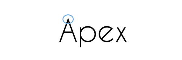 |
| Fig. 1.4 Apex |
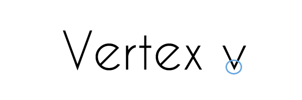 |
| Fig. 1.5 Vertex |
6. Arm: Short strokes off the stem of the letterform, either horizontal (E, F, L) or inclined upward (K, Y) (Fig. 1.6).
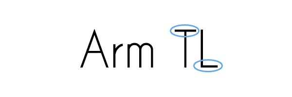 |
| Fig. 1.6 Arm |
7. Ascender: The portion of the stem of a lowercase letterform that projects above the median (Fig. 1.7).
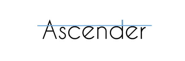 |
| Fig. 1.7 Ascender |
8. Barb: The half-serif finish on some curved stroke (Fig. 1.8).
9. Beak: The half-serif finish on some horizontal arms (Fig.1.9).
10. Bowl: The rounded form that describes a counter. The bowl may be either open or closed (Fig. 1.10).
11. Bracket: The transition between the serif and the stem.
12. Cross Bar: The horizontal stroke in a letterform that joins two stems together (Fig. 1.11).
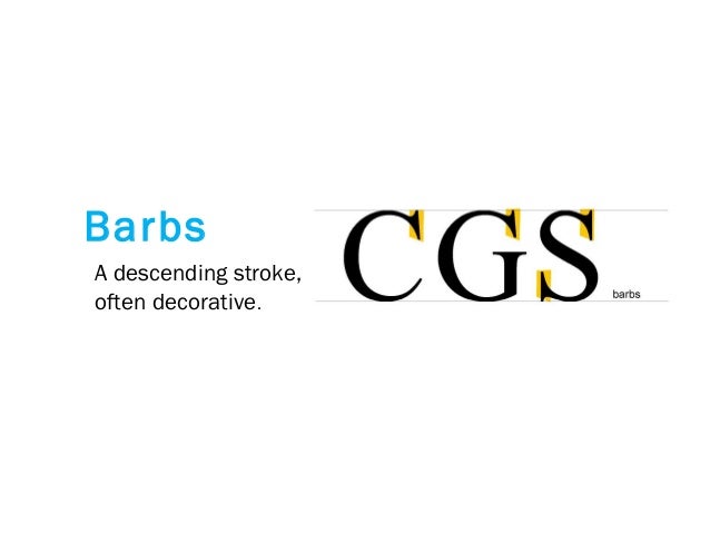 |
| Fig. 1.8 Barb |
9. Beak: The half-serif finish on some horizontal arms (Fig.1.9).
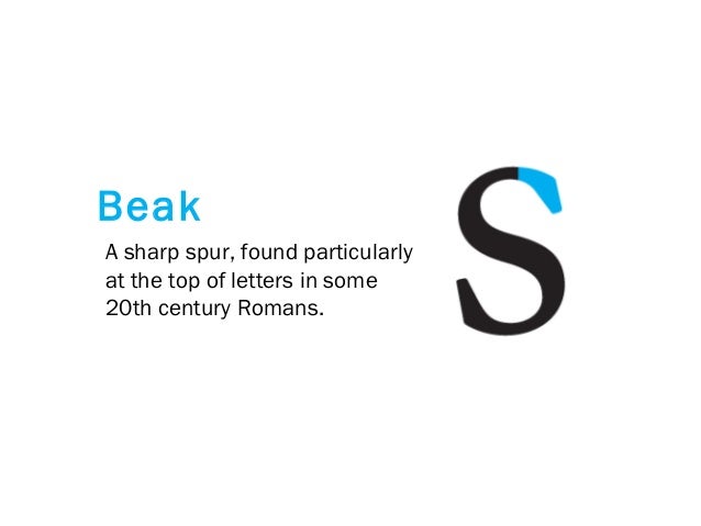 |
| Fig. 1.9 Beak |
10. Bowl: The rounded form that describes a counter. The bowl may be either open or closed (Fig. 1.10).
| Fig. 1.10 Bowl |
11. Bracket: The transition between the serif and the stem.
12. Cross Bar: The horizontal stroke in a letterform that joins two stems together (Fig. 1.11).
 |
| Fig. 1.11 Cross Bar |
13. Cross Stroke: The horizontal stroke in a letterform that joins two stems together (Fig. 1.12).
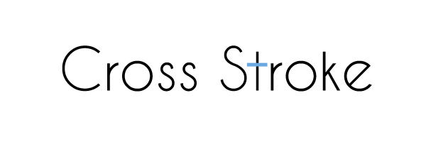 |
| Fig. 1.12 Cross stroke |
14. Crotch: The interior space where two strokes meet (Fig. 1.13).
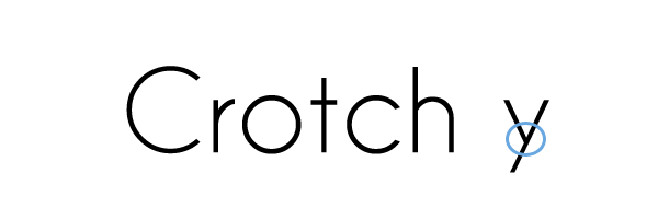 |
| Fig. 1.13 Crotch |
15. Descender: The portion of the stem of a lowercase letterform that projects below the baseline (Fig. 1.14).
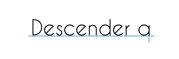 |
| Fig. 1.14 Descender |
16. Ear: The stroke extending out from the main stem or body of the letterform (Fig. 1.15).
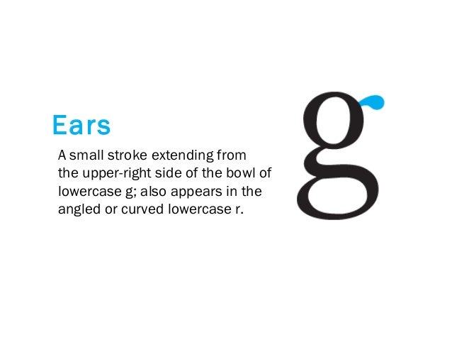 |
| Fig. 1.15 Ear |
17. Em/en: Originally referring to the width of an uppercase M, and em is now the distance equal to the size of the typeface (an em in 48 points, for example). An en is half the size of an em. Most often used to describe em/en spaces and em/en dashes.
18. Finial: The rounded non-serif terminal to a stroke.
19. Leg: Short stroke off the stem of the letterform, either at the bottom of the stroke (L) or inclined downward (K, R).
20. Ligature: The character formed by the combination of two or more letterforms (Fig. 1.16).
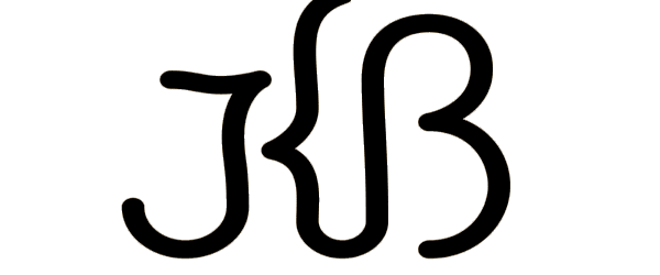 |
| Fig. 1.16 Ligature |
21. Link: The stroke that connects the bowl and the loop of a lowercase G (Fig. 1.17).
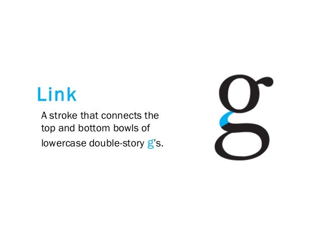 |
| Fig. 1.17 Link |
22. Loop: In some typefaces, the bowl created in the descender of the lowercase G (Fig. 1.18).
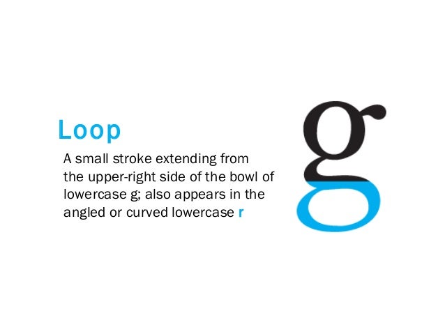 |
| Fig. 1.18 Loop |
23. Serif: The right-angled or oblique foot at the end of the stroke (Fig. 1.19).
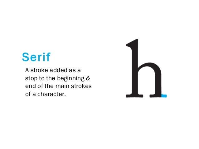 |
| Fig. 1.19 Serif |
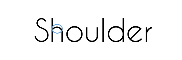 |
| Fig. 1.20 Shoulder |
25. Spine: The curved stem of the S (Fig. 1.21).
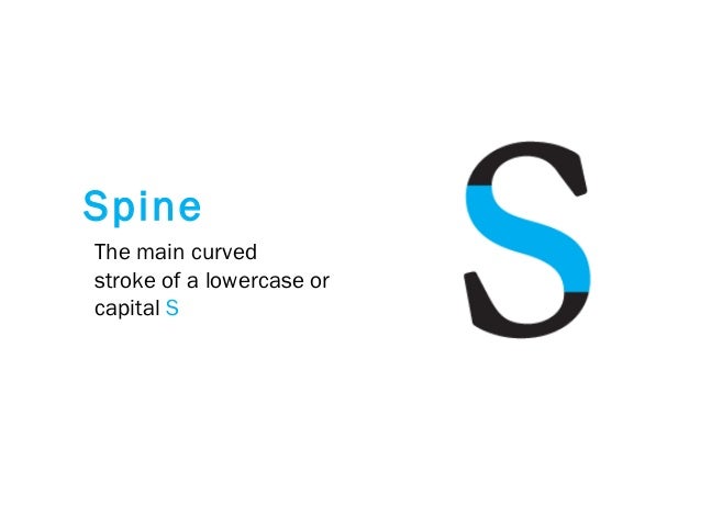 |
| Fig. 1.21 Spine |
26. Spur: The extension the articulates the junction of the curved and rectilinear stroke.
27. Stem: The significant vertical or oblique stroke (Fig. 1.22).
 |
| Fig. 1.22 Stem |
28. Stress: The orientation of the letterform, indicated by the thin stroke in round forms.
29. Swash: The flourish that extends the stroke of the letterform (Fig. 1.22).
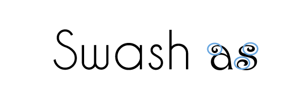 |
| Fig. 1.22 Swash |
30. Tail: The curved diagonal stroke at the finish of certain letterforms (Fig. 1.23).
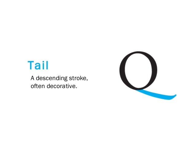 |
| Fig. 1.24 Tail |
31. Terminal: The self-contained finish of a stroke without a serif. This is something of a catch-all term. Terminals may be flat (‘T’ above), flared, acute, (‘t’ above), grave, concave, convex, or rounded like a ball or a teardrop (see finial) (Fig. 1.25).
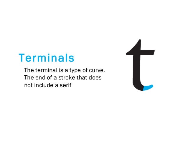 |
| Fig. 1.25 Terminal |
32. Uppercase: Capital letters, including certain accented vowels, the c cedilla, and n tilde, and the a/e and o/e ligatures.
33. Lowercase: Lowercase letters include the same characters as uppercase.
34. Small Capitals: Uppercase letterforms draw to the x-height of the typeface. Small Caps are primarily found in serif fonts as part of what is often called an expert set (Fig. 1.26).
| Fig. 1.26 Small capitals |
35. Uppercase Numerals: Also called lining figures, these numerals are the same height as uppercase letters and are all set to the same kerning width. They are most successfully used with tabular material or in any situation that calls for uppercase letters.
36. Lowercase Numerals: Also known as old-style figures or text figures, these numerals are set to x-height with ascenders and descenders. They are best used whenever you would use upper and lowercase letterforms. Lowercase numerals are far less common in sans serif type-faces than in serif.
| Fig. 1.27 The difference between uppercase numerals and lowercase numerals |
37. Punctuation and miscellaneous characters: Although all fonts contain standard punctuation marks, miscellaneous characters can change from typeface to typeface (Fig. 1.28).
| Fig. 1.28 Punctuation and miscellaneous characters |
38. Ornaments: Used as flourishes in invitations or certificates. They usually are provided as a font in a larger typeface family. Only a few traditional or classical typefaces contain ornamental fonts as part of the entire typeface family (Adobe Caslon Pro).
| Fig. 1.29 Ornaments |
39. Roman: The letterform is so-called because the uppercase forms are derived from inscriptions of Roman monuments. A slightly lighter stroke in roman is known as ‘Book’.
40. Italic: The forms in an italic refer back to fifteenth-century Italian cursive handwriting. Oblique is typically based on the roman form of the typeface.
41. Boldface: Characterized by a thicker stroke than a roman form. Depending upon the relative stroke widths within the typeface, it can also be called ‘semibold’, ‘medium’, ‘black’, ‘extra bold’, or super. In some typefaces (notably Bodoni), the boldest rendition of the typeface is referred to as ‘Poster’.
42. Light: A lighter stroke than the roman form. Even lighter strokes are called ‘thin’.
43. Condense: A version of the roman form, and extremely condense styles are often called ‘compressed’.
44. Extended: An extended variation of a roman font.
| Fig. 1.30 Examples of typefaces |
Comparing typefaces
Fig. 1.31 shows the similarities as well as the differences between the 9 typefaces. Beyond the gross differences in x-height, the forms display a wealth of variety, in line weight, relative stroke widths and in feeling. For any typographer, these feelings connote specific use and expression.
| Fig. 1.31 Comparison of typefaces |
Week 8 (16/10/19): Understanding Letterforms
We, in general, would think the letter below is symmetrical. But in fact, it's not. When you start dissecting it, it would be easier to see the two different stroke weights of the Baskerville stroke form (below); more noteworthy is the fact that each bracket connecting the serif to the stem has a unique arc (Fig. 1.32).
| Fig. 1.32 Dissection of Baskerville 'A' |
The Univers 'A' below also may appear symmetrical, but a close examination shows that the width of the left slope is thinner than the right stroke (Fig. 1.33).
| Fig. 1.33 Dissection of Univers 'A' |
Once again, Helvetica and Univers may seem the same at first sight, but when it's meticulously dissected, a palpable difference can be seen (Fig. 1.34).
| Fig. 1.34 Difference between Helvetica 'a' and Univers 'a' |
Typographers also have to take note of the curved strokes. For example, ‘s’, must rise above the median (or sink below the baseline) in order to appear to be the same size as the vertical and horizontal strokes they adjoin (Fig. 1.35).
| Fig. 1.35 How should curved strokes be organized differently |
Counterform is another term we were introduced to in today's lecture. It is the space often contained, by the strokes of the form. When letters are joined to form words, the counterform includes the spaces between them (Fig. 1.36).
| Fig. 1.36 Counterform |
| Fig. 1.37 Counterform can be examined in detail by enlarging the letters |
INSTRUCTION
Exercise
Week 7 (09/10/19): Introduction to Project 2
Mr. Vinod briefed us on what Project 2, which is where we can create our own font by drawing inspirations from the 9 typefamilies given by the lecturers earlier on. He showed us some of the seniors' works to give us an idea about how's the project like, and how should we execute it.
To begin with, we have to choose a typeface we want to work on and dissect a few letters from it. Then, we will have to sketch out our ideas for our own font design and upon approval from the lecturers, proceed to digitize them on Adobe Illustrator. Mr. Vinod gave us a total of 11 letters, namely d, g, i, s, n, o, e, h, t, k, r, and 3 punctuations: exclamation mark, comma, and period. Finally, we would have to generate our font on FontLab Studio 5 and make our font an actual font. Kerning and em-space should also take note while generating the font on the software as well. A sentence will be given to us by the lecturers so we can type it out by using the font we created.
After looking through the 9 typefamilies, I settled on Futura Std because it's one of my favorite fonts hence I wish to understand it better through this project. I dissected the 4 letters, d, g, k, and s for a more in-depth understanding of how it's formed (Fig. 2.1, 2.2, 2.3, 2.4)
 |
| Fig. 2.1 Dissection of Futura Std 'd' |
Everyone has a different way of dissecting it and it's okay since this exercise's objective is to let us understand how the letters are formed. Then, we were required to come up with our own font designs by drawing inspirations from the font we chose. Below are the 6 designs I came up with in class. 3 of them got rejected, and I was told to work on the other 3. Below are the sketches I came up with in class (Fig. 2.5, 2.6, 2.7).
After showing the lecturers my sketches, I settled on the third sketch, which is to introduce a stencil font on Futura Std. I created a more detailed and neat sketch so I can refer to it while digitizing (Fig. 2.8).
Then, I started to digitalize the letters by using Adobe Illustrator. To begin with, I created guidelines with 500pt for the x-height since that is the default x-height that will be used in FontLab Studio 5, 850pt for the ascender, and -270 for the descender (Fig. 2.9).
Then, I created a textbox and keyed in the first letter that I am going to animate, which is the letter 'd'. I created an oval shape based on the bowl of 'd' with red so I can differentiate between the text and shape (Fig. 2.10).
The following steps are the process of forming the letter 'd' (Fig. 2.11, 2.12, 2.13).
 |
| Fig. 2.8 Final sketch |
Then, I started to digitalize the letters by using Adobe Illustrator. To begin with, I created guidelines with 500pt for the x-height since that is the default x-height that will be used in FontLab Studio 5, 850pt for the ascender, and -270 for the descender (Fig. 2.9).
 |
| Fig. 2.9 Guidelines created on Adobe Illustrator |
Then, I created a textbox and keyed in the first letter that I am going to animate, which is the letter 'd'. I created an oval shape based on the bowl of 'd' with red so I can differentiate between the text and shape (Fig. 2.10).
 |
| Fig. 2.10 Tracing the bowl of 'd' |
The following steps are the process of forming the letter 'd' (Fig. 2.11, 2.12, 2.13).
 |
| Fig. 2.11 Assembling different shapes that form the letter 'd' |
 |
| Fig. 2.12 Adding a box to create the stencil effect on my font |
 |
| Fig. 2.13 Filling the shape with black |
I found that the stencil gap should be smaller as compared to the stem, hence I reduced the size of the stencil gap (Fig. 2.14).
 |
| Fig. 2.14 Revised letter 'd' |
I, too, realized that the thickness of the bowl isn't the same, thus I amended it by shifting the white oval shape on top of the bowl. Rectangular boxes were also utilized to ensure that the height/width of the strokes is the same (Fig. 2.15, 2.16).
 |
| Fig. 2.15 Measuring the thickness of the strokes with boxes |
 |
| Fig. 2.16 Guides are used to replace the rectangular boxes |
I used the same technique to create 'g' and 's' as well. It was indeed very challenging to get the strokes right (Fig. 2.17, 2.18).
 |
| Fig. 2.17 The letter 'g' |
 |
| Fig, 2.18 The letter 's' |
Week 8 (16/10/19): Continuation of Project 2
After creating all the letters, I showed them to the lecturers for feedback. Mr. Vinod commented that the strokes are consistent, however, there is a lack of interesting elements in my font. Hence, he suggested me to check out semi-san serif typefaces as a reference to improvised my font. I found a semi-san serif typeface: Getho (Fig. 2.19), as well as a stencil typeface: Crafto (Fig. 2.20), as my references.
After creating all the letters, I showed them to the lecturers for feedback. Mr. Vinod commented that the strokes are consistent, however, there is a lack of interesting elements in my font. Hence, he suggested me to check out semi-san serif typefaces as a reference to improvised my font. I found a semi-san serif typeface: Getho (Fig. 2.19), as well as a stencil typeface: Crafto (Fig. 2.20), as my references.
 |
| Fig. 2.19 Getho typeface |
 |
| Fig. 2.20 Crafto typeface |
Intending to experiment with my font a little, I created two types of fonts, with a minimal amendment. The font above has extra semi-san serif while the bottom one does not (Fig. 2.21).
 |
| Fig. 2.21 Experimenting with font characteristics |
Week 8 (16/10/19): Finalization of Project 2
As for today's class, I showed the lecturers my digitization of font for feedback and amended my font accordingly based on the feedback given. Below is my final digitization of font on Adobe Illustrator (Fig. 2.22).
After placing the font, I started the kerning process. Mr. Vinod advised us to remain the left letter spacing as 0 and only adjust the one on the right. Below is the kerning result (Fig. 2.25).
Then, I typed out the given text by the lecturers which is 'god is in the kerning' to check out if my kerning is alright (Fig. 2.26). I also added punctuations like ellipsis and exclamation mark to make the sentence more interesting.
The following step was to generate our font and save it as a true font/ open font(*.ttf) file. I then opened the exported file and installed the font onto the system. The final step was to type the sentence given on Adobe Illustrator and label it with "font name by name, 2019".
Below are some layout attempts I came up with for Project 2 (Fig. 2.27 - 2.30).
After much consideration, I settled on my 4th attempt as my final submission because I prefer the layout the most. Below are the JPEG (Fig. 2.31) and PDF (Fig. 2.32) of it.
Fig. 2.32 'god is in the kerning': JPEG
FEEDBACK
Specific feedback: Mr. Vinod found my second, third and fifth font design sketch interesting and I can start digitizing them for the next lesson. The slanting angle for the fifth font design should be decreased. My e-portfolio is complete.
Week 8 (16/10/19):
General feedback: The font we design should not only look good on itself but should also look elegant when placed together. We should always update our blog as well.
Specific feedback: My font, in general, appears consistent. Most of the letters of my font have consistent strokes, except for the letter 'n' where its 'shoulder' is slightly inconsistent. The 'e' in my font isn't working because it looks like a power sign. Mr. Vinod suggested me to change the blank space left for 'e' to create the stencil feeling to another part of the letter. However, the font looks too simple thus Mr. Vinod suggested me to add some other elements to it to make it more interesting. I was recommended to check out semi sans typefaces and use them as references while creating my font.
Feedback on Google sheet: Your e-portfolio is well updated and very clean. Keep it up.
Week 9 (21/10/19):
Specific feedback: The first typeface is preferred. The letter 't' should either end with a slant with a decreased thickness of the stroke, or a uniform and straight stroke. I should clean up my font as well.
Week 9 (23/10/19):
General feedback: We should export our file as an open/true type. Once we were done with our kerning on FontLab Studio, we should type out 'god is in the kerning' then proceed with generating our font. We can design the placement of our font in whichever way we want to, without changing the font size, on an A4 size paper on Adobe Illustrator. The final piece should be labeled as 'font name by name, 2019'.
Specific feedback: I should change the crossbar of the letter 'e' into a thinner stroke.
Week 10 (28/10/19):
Specific feedback: What is it aligned to? Needs to be Helvetica/Arial 7 points.
Week 10 (30/10/19):
General feedback: Every word in the sentence should have the same point size. The label at the end of our page should be in Helvatica or Arial typeface, and in 7pt. We are also advised to try out different alignments for the sentence given and check which looks the best for our font.
Specific feedback: For my third layout design, the 'is' in 'god is in the kerning' should be in the middle of 'in the'. Mr. Vinod approved my final layout design as well. He commented that the line spacing between each word should be the same.
REFLECTION
FURTHER READING
 |
| Fig. 2.22 11 digitization letters and 3 punctuation marks arranged on a baseline |
Then I created the outline of my font (Fig. 2.23), and proceed to place them on FontLab Studio 5.0 (Fig. 2.24).
 |
| Fig. 2.23 Outline of my font |
 |
| Fig. 2.24 FontLab Studio 5.0 |
 |
| Fig. 2.25 Kerning |
 |
| Fig. 2.26 The given sentence: god is in the kerning |
The following step was to generate our font and save it as a true font/ open font(*.ttf) file. I then opened the exported file and installed the font onto the system. The final step was to type the sentence given on Adobe Illustrator and label it with "font name by name, 2019".
Below are some layout attempts I came up with for Project 2 (Fig. 2.27 - 2.30).
 |
| Fig. 2.27 Attempt 1 |
 |
| Fig. 2.28 Attempt 2 |
 |
| Fig. 2.29 Attempt 3 |
 |
| Fig. 2.30 Attempt 4 |
After much consideration, I settled on my 4th attempt as my final submission because I prefer the layout the most. Below are the JPEG (Fig. 2.31) and PDF (Fig. 2.32) of it.
 |
| Fig. 2.31 'god is in the kerning': JPEG |
Fig. 2.32 'god is in the kerning': JPEG
FEEDBACK
Week 7 (09/10/19):
General feedback: Mr. Shamsul reminded us that we only have to embed the PDF file for our final submission. We should have at least two posts updated by today and there should only be one label for Typography. As for the font design, it should show integrity, be less expressive and readable. The comments given on our feedback have to be documented in our e-portfolio. The caption of our final submission should also include an explanation of our idea.
Specific feedback: Mr. Vinod found my second, third and fifth font design sketch interesting and I can start digitizing them for the next lesson. The slanting angle for the fifth font design should be decreased. My e-portfolio is complete.
Week 8 (16/10/19):
General feedback: The font we design should not only look good on itself but should also look elegant when placed together. We should always update our blog as well.
Specific feedback: My font, in general, appears consistent. Most of the letters of my font have consistent strokes, except for the letter 'n' where its 'shoulder' is slightly inconsistent. The 'e' in my font isn't working because it looks like a power sign. Mr. Vinod suggested me to change the blank space left for 'e' to create the stencil feeling to another part of the letter. However, the font looks too simple thus Mr. Vinod suggested me to add some other elements to it to make it more interesting. I was recommended to check out semi sans typefaces and use them as references while creating my font.
Feedback on Google sheet: Your e-portfolio is well updated and very clean. Keep it up.
Week 9 (21/10/19):
Specific feedback: The first typeface is preferred. The letter 't' should either end with a slant with a decreased thickness of the stroke, or a uniform and straight stroke. I should clean up my font as well.
Week 9 (23/10/19):
General feedback: We should export our file as an open/true type. Once we were done with our kerning on FontLab Studio, we should type out 'god is in the kerning' then proceed with generating our font. We can design the placement of our font in whichever way we want to, without changing the font size, on an A4 size paper on Adobe Illustrator. The final piece should be labeled as 'font name by name, 2019'.
Specific feedback: I should change the crossbar of the letter 'e' into a thinner stroke.
Week 10 (28/10/19):
Specific feedback: What is it aligned to? Needs to be Helvetica/Arial 7 points.
Week 10 (30/10/19):
General feedback: Every word in the sentence should have the same point size. The label at the end of our page should be in Helvatica or Arial typeface, and in 7pt. We are also advised to try out different alignments for the sentence given and check which looks the best for our font.
Specific feedback: For my third layout design, the 'is' in 'god is in the kerning' should be in the middle of 'in the'. Mr. Vinod approved my final layout design as well. He commented that the line spacing between each word should be the same.
REFLECTION
Experience
Week 7 (09/10/19); It was, once again, a very insightful lecture today, as we learned a lot about the anatomy of letterforms. We were also given the chance to dissect the letters and it was a really fun experience for me! I enjoyed the process of dissecting and understanding more about how a letter is formed from scratch. Week 8 (16/10/19); Today's class was rather chill as we were all utilizing the hours to digitize our fonts. Besides, Mr. Vinod also showed us how to use FontLab Studio 5, a software which we will be using upon our completion of the digitization of fonts. Week 9 (23/10/19); It was a really fun experience to be able to generate our own font! I now can understand how laborious the process is for a typographer to go through in order to create a font and won't take any font for granted from now on.
Observation
Week 7 (09/10/19); Based on my observation, I noticed that I really enjoyed the letter dissecting process. I was given the chance to observe how letters are formed by shapes and how the different weights of strokes can have different impacts on the looks of a letter. Week 8 (16/10/19); I am quite surprised when I noticed we can come up with different ideas for our fonts even if it's based on one typeface. It's interesting to look around others' work and observed how they create their fonts too. Week 9 (23/10/19); It was nice to see the camaraderie formed between classmates and how one is willing to help another when he/she encounters an issue in this class. I noticed the lecturers were very patient in giving feedback as well regardless of the huge class size.
Findings
Week 7 (09/10/19); I find it amazing when I was brainstorming for my font ideas. When we were asked to design our fonts, I came up with a system on my mind which basically introduces types of amendments that can be made, for instance, addition (adding elements to type), subtraction (eliminating elements from type), substitution (replacing elements of type with other elements), and dissection (creating a stencil feeling on the type). Week 8 (16/10/19); After Mr. Vinod introduced some other elements that can be added to my font, I find that I can actually combine the different types of amendments in the system I created on my mind last week, and not merely introducing a single amendment to my font. That would make my font more interesting as well. Week 9 (23/10/19); I find that one has to have an eye for details if he/she wants to create a perfect font. Everything is extremely time-consuming but will be worthwhile at the end.
FURTHER READING
Week 7 (09/10/19)
Book title - Type Team
Author - Tony Seddon
This book is an ultimate guide for anyone wishing to get to grips with the best techniques for combining individual typefaces from all classifications and styles for any category of creative project. There are a few tricks introduced to the readers while choosing typefaces to combine, one of which is by mixing serifs and sans serifs. Using a sans serif for headlines and a serif for running text is one of the oldest type tricks in the book, but there are a few other traits associated with serifs and sans serifs that might come in useful:
- Serif faces are able to convey a sense of history that extends back beyond the nineteenth century, so they potentially provide one with a greater range of contextual options.
- Sans serif faces can handle tighter inter-character spacing than serif faces, so are a good choice for space-saving and attention-grabbing headlines.
Week 8 (16/10/19)
Book title: Virtual Typography
Author: Matthias Hillner
One of the chapters in this book discusses digital typography, a type of typography which has led to the fusion of various production-related tasks in the field of visual designs. Since the introduction of desktop computers, individual users have increasingly tried to master multiple specialist tasks such as type design, layout, illustration and production management. As a result, the significance of the graphic designer changed dramatically: the designer could feasibly now technically cover a larger variety of tasks, but his professional status became increasingly threatened by amateurs who could operate the necessary software applications.
I also found Fig. 5.3 interesting as it reveals how a simple line pattern can be used effectively to create graphic transitions from one word to the next. One of the takeaway from this book is that: as the use of media technologies changes constantly in the context of visual communication, designers need to continuously adapt their principles to evolving means of expression.
Author - Tony Seddon
 |
| Fig. 5.1 Book cover |
This book is an ultimate guide for anyone wishing to get to grips with the best techniques for combining individual typefaces from all classifications and styles for any category of creative project. There are a few tricks introduced to the readers while choosing typefaces to combine, one of which is by mixing serifs and sans serifs. Using a sans serif for headlines and a serif for running text is one of the oldest type tricks in the book, but there are a few other traits associated with serifs and sans serifs that might come in useful:
- Serif faces are able to convey a sense of history that extends back beyond the nineteenth century, so they potentially provide one with a greater range of contextual options.
- Sans serif faces can handle tighter inter-character spacing than serif faces, so are a good choice for space-saving and attention-grabbing headlines.
Week 8 (16/10/19)
Book title: Virtual Typography
Author: Matthias Hillner
 |
| Fig. 5.2 Book cover |
One of the chapters in this book discusses digital typography, a type of typography which has led to the fusion of various production-related tasks in the field of visual designs. Since the introduction of desktop computers, individual users have increasingly tried to master multiple specialist tasks such as type design, layout, illustration and production management. As a result, the significance of the graphic designer changed dramatically: the designer could feasibly now technically cover a larger variety of tasks, but his professional status became increasingly threatened by amateurs who could operate the necessary software applications.
 |
| Fig. 5.3 A page of the book |
I also found Fig. 5.3 interesting as it reveals how a simple line pattern can be used effectively to create graphic transitions from one word to the next. One of the takeaway from this book is that: as the use of media technologies changes constantly in the context of visual communication, designers need to continuously adapt their principles to evolving means of expression.





Typography - Project 2 >>>>> Download Now
ReplyDelete>>>>> Download Full
Typography - Project 2 >>>>> Download LINK
>>>>> Download Now
Typography - Project 2 >>>>> Download Full
>>>>> Download LINK 56