TYPOGRAPHY - FINAL PROJECT

30/10/19 - 20/11/19(Week 10 - Week 13)
See Zi Yi (0340094)
Typography
Final Project
LECTURE
INSTRUCTION
Exercise
Week 10 (30/10/19): Introduction to Final Project (Protest Placard)
As part of our final project, we were assigned to design our own protest placard with a one-line manifesto: our belief about "design" and "society". Before coming to class today, we were required to bring along the following materials:
1. Five’-Seven’ (feet) long stick (broomstick)
2. Card Board or corrugated board (A2 ish)
3. Single line Manifesto
4. Thick brush/Marker/Paint
5. Newspaper
6. Black Chinese ink
7. Glue gun (optional)
I came up with a few lines as my manifesto, namely:
1. Design for social change/ impact
2. Design to ignite change
3. Design for user empowerment
4. Design for society, by society
After consulting Mr. Vinod, I narrowed down my potential manifesto to "Design to ignite change" and "Design for society, by society", as both of these seem more catchy and impactful. However, Mr. Vinod mentioned that we could use our own mother tongue for our manifesto as well. Hence I decided to use "为改变 而设计" which is the Chinese translation of "Design to ignite change". The English translation will be included below it for a better understanding for all. Here is the pronunciation for each Chinese word: "为(wei)改(gai)变(bian) 而(er)设(she)计(ji)".
Without further ado, I came up with a few layout designs as follows (Fig. 2.0). However, I decided to change my English translation to " Design for Change" because it's more straightforward and catchy.
 |
| Fig. 2.0 Sketches on layout design |
I settled on the fifth design and started to sketch out a more detailed draft (Fig. 2.1).
 |
| Fig. 2.1 Detailed sketch for my final layout design |
Upon finalizing on the layout design, I tried out some strokes on pieces of blank papers (Fig. 2.2 and 2.3).
 |
| Fig. 2.2 Testing the strokes 1 |
 |
| Fig. 2.3 Testing the stroke 2 |
Below is a work in progress picture I captured (Fig. 2.4).
 |
| Fig. 2.4 Working in progress |
After hours of working on my protest placard, below is the final outcome (Fig. 2.5).
 |
| Fig. 2.5 The final outcome of my protest placard |
Week 11 (06/11/19): Introduction to Final Project (Poster)
Since we have created our protest placard, we now will work on creating a poster with the chosen manifesto digitally on Adobe Illustrator. This is a great chance for us to fix the layout of our protest placard if we are not satisfied with it. Mr Vinod reminded us that the final project is a project which aims to spread awareness about current social issues in Taylor's University, which should be created based on a few guidelines as below:
- The size should be in A3
- Only 3 colours are allowed in the layout
- Minimal (5% - 10%) graphical elements are allowed
- No distortion of the typeface is allowed
- Typefaces used should be chosen from the 8 typefamilies given at the beginning of the semester
- The typefaces for other languages can be downloaded from the Internet
To begin with, I searched up for Chinese typefaces which look suitable for my poster. It was rather difficult to find one that is suitable and free for download at the same time, but I am glad that I found one at the end. Upon finalizing the Chinese typeface, I started to work on my layout again, as I don't think my initial layout expresses the meaning of my sentence well enough. Below are the layout attempts I brainstormed in class.
 |
| Fig. 2.7 Layout designs |
To begin with, I chose a few potentials typefaces and laid them out on an artboard.
Below is the very first attempt at the layout design (Fig. 2.9). Unfortunately, it didn't seem like a poster at all, and the composition is very off. Hence, I tried out more layout designs.
Since we were told to incorporate what we have learnt earlier on, especially Exercise 2 (Type expression), and Project 1 (layout), I tried expressing the word "change" by using a different typeface of the Futura typefamily. However, the feedback I received from the lecturers was that my poster is too messy and there's a lot of noise. Below is the attempt (Fig. 2.10).
By the end of today's class, I came up with another 2 layout designs which in my opinion, still didn't really work. This time, I experimented with colours as well.
The feedback I received after showing these attempts was that I needed to search up for references which I can refer to for better layout design and overall composition. Here are some examples I found (Fig. 2.14 & 2.15).
 |
| Fig. 2.8 Potential typefaces |
Below is the very first attempt at the layout design (Fig. 2.9). Unfortunately, it didn't seem like a poster at all, and the composition is very off. Hence, I tried out more layout designs.
 |
| Fig. 2.9 First attempt |
Since we were told to incorporate what we have learnt earlier on, especially Exercise 2 (Type expression), and Project 1 (layout), I tried expressing the word "change" by using a different typeface of the Futura typefamily. However, the feedback I received from the lecturers was that my poster is too messy and there's a lot of noise. Below is the attempt (Fig. 2.10).
 |
| Fig. 2.10 Second attempt |
By the end of today's class, I came up with another 2 layout designs which in my opinion, still didn't really work. This time, I experimented with colours as well.
 |
| Fig. 2.11 Second attempt (white background) |
 |
| Fig. 2.12 Second attempt (black background) |
 |
| Fig. 2.13 Third attempt |
The feedback I received after showing these attempts was that I needed to search up for references which I can refer to for better layout design and overall composition. Here are some examples I found (Fig. 2.14 & 2.15).
 |
| Fig. 2.14 Reference #1 |
 |
| Fig. 2.15 Reference #2 |
After researching, I realized that placing the Chinese words vertically and horizontally didn't work hence I attempted to place them diagonally. Below are the attempts (Fig. 2.16 & 2.17).
 |
| Fig. 2.16 Fourth attempt (white background) |
 |
| Fig. 2.17 Fourth attempt (black background) |
However, the composition doesn't seem interesting to me, hence I tried another layout design where I amended the placement of 为 (because/due to) and 而 (hence/therefore), because, in my opinion, there are not the keywords which should be given much emphasis on as compared to 改变 (change) and 设计 (design). Aside from that, I also did a subtle type expression on the word "change" by adding a drop shadow to it. Below is the layout design (Fig. 2.18).
 |
| Fig. 2.18 Fifth attempt |
To better improve my design, I decided to ask a senior from my club, who is a content creator for the Instagram account of AIESEC (an international youth-run organization) in Malaysia, for feedback. The first impression of my design, to him, is that it looks like some Hong Kong movie poster, which I think is indeed very true. For Fig. 2.17, He commented that I should change the typeface for my English words to a typeface which is less bold and has lesser weight, as the Chinese stroke itself is bold. The overall composition is too strong and viewers might feel uncomfortable while reading it. As for Fig. 2.18, he commented that 为 (because/due to) and 而 (hence/therefore) captured his attention first. The emphasis given is incorrect.
With the feedback, I revised my layout designs again by:
- Reducing the point size of 为 (because/due to) and 而 (hence/therefore)
- Changing the colour of the "为改变 DESIGN FOR" from red to yellow
Below is the revised layout design (Fig. 2.19). However, I thought it's still lacking something in the composition and it felt a little too plain to me.
 |
| Fig. 2.19 Sixth attempt |
I didn't know how to improve my design so I just went through my initial attempts, in hopes I would somehow find a way to amend my current layout. Fortunately, my second initial attempt reminded me about type expression, which I find it suitable to be included in my current layout. So I played around with the word "change", to find the best way to express it. Below is my first attempt at type expression for the word "change" (Fig. 2.20).
 |
| Fig. 2.20 Sixth attempt: type expression (drop shadow) |
I found the white space on the left of the word "change" very disturbing, so I tried making a line of the word "change" to fill up the space (Fig. 2.21 & 2.22). It was hard balancing the readability of the word when drop shadow is added and the accuracy of expressing the word. With an obvious drop shadow, the readability will be affected; with a subtle drop shadow, the accuracy of expressing the type will drop.
 |
| Fig. 2.21 Sixth attempt: type expression (drop shadow from the bottom left) |
 |
| Fig. 2.22 Sixth attempt: type expression (drop shadow from the top right) |
The drop shadow didn't work well so I attempted something else: to play with the opacity of the type to show a change in gradient. Below are two of my attempts (Fig. 2.23 & 2.24).
 |
| Fig. 2.23 Sixth attempt: type expression (change in opacity with space between words) |
 |
| Fig. 2.24 Sixth attempt: type expression (change in opacity without space between words) |
Week 12 (13/11/19): Final Project (Poster)
In today's class, I showed my revised designs again to the lecturers, and Mr Vinod suggested me to refine my artwork by creating an engraved Chinese text as shown in the figure below. It is commonly seen on Chinese wooden signboard.
 |
| Fig. 2.25 Engraved text on Chinese wooden signboard |
Below are my attempts at creating this effect. Fig. 2.26 shows my first attempt, where I used the "Extrude and Bevel Tool" from the "Effect" panel to create a 3D-liked typeface. However, noise appeared around the words, which doesn't really enhance the readability of the words. Hence, I moved on trying out other effects.
 |
| Fig. 2.26 First attempt at creating an engraved text effect |
Fig. 2.27 is my second attempt, where I used the "Inner Glow Tool" and "Drop Shadow Tool" to create my desired effect. However, it looks too soft and doesn't suit the vibe of my poster well. At last, I decided to stick to my sixth attempt (Fig. 2.24), as I think it stands out the most.
 |
| Fig. 2.27 Second attempt at creating an engraved text effect |
Below is my final outcome for the Final Project, in both JPEG (Fig. 2.28) and PDF (Fig. 2.29) format.
 |
| Fig. 2.28 Final Project Poster: JPEG |
Fig. 2.29 Final Project Poster: PDF
To animate it on Adobe Photoshop, I created 87 artboards, each frame with specific strokes/letters/words to appear, on Adobe Illustrator to be exported.
 |
| Fig. 2.30 87 artboards used |
Then, I loaded the files into a stack on Adobe Photoshop and started the animating process by showing only one layer at a frame. I added a layer with a black solid colour as the last layer to ensure that the background colour remains the same throughout the animation, and no borderlines of the artboard would appear.
 |
| Fig. 2.31 Animating on Adobe Photoshop |
Upon completion of placing each layer on each frame, I adjusted the delay setting of each frame. I provided emphasis for words like "DESIGN FOR" by increasing the lengthening the duration of the delay. As for the Chinese strokes, my initial attempt for its duration of delay for each stroke is 0.1 second. Below is the outcome.
 |
| Fig. 2.32 First attempt at animating (0.1s) |
I realized the strokes appear too quickly hence I adjusted the duration of the delay to 0.2 seconds. Below is the outcome.
 |
| Fig. 2.33 Second attempt at animating (0.2s) |
Unfortunately, I realized the opacity of the "CHANGE" wasn't the same as my poster design, hence I returned to Adobe Illustrator to amend and exported them again to Adobe Photoshop.
This time, I think it's a little too slow for the strokes to appear, hence I adjusted the duration of the delay again, to 0.12 seconds. Below is the outcome.
 |
| Fig. 2.34 Third attempt at animating (0.12s) |
As I was still unsatisfied of the outcome, I continued experimenting with the duration of the delay within the range of 0.11 to 0.18 seconds to identify the most suitable duration to delay each stroke. Below is my fourth GIF attempt with 0.15 seconds of delay between each Chinese stroke. I realized that a pause is needed before the yellow-coloured Chinese characters from the first line proceed to the white-coloured Chinese characters on the second line. Hence, I amended it again.
 |
| Fig. 2.35 Fourth attempt at animating (0.15s) |
 |
| Fig. 2.36 Fifth attempt at animating (0.16s) |
 |
| Fig. 2.37 Sixth attempt at animating (0.18s) |
After much consideration, I settled on the GIF in Fig. 2.35, as I think the speed chosen to write each stroke is the best among all.
 |
| Fig. 2.38 Improvised fourth attempt |
However, Mr Shamsul advised me to shorten the duration of the delay to make the animation move faster, with a 0.12seconds of delay for each stroke and 0.2 seconds of delay after the first row of Chinese words, hence I amended it again and below is my final animation.
 |
| Fig. 2.39 Final GIF |
FEEDBACK
Week 10 (30/10/19):
General feedback: While working on our protest placard, we were told to work fast as the class will be used by other students at 3pm. Mr Vinod commented that using a board bigger than A2 size is fine, and in fact, better.
Specific feedback: Mr Vinod found my fifth layout design interesting and I can work on that. Besides, I was advised to work fast as well and not spend too much time on sketching. Mr Shamsul also asked me to try out the brush strokes before actually penning down the sentence on my corrugated board. While I was writing a Chinese character, Mr Vinod passed by my seat and complimented that it looks nice!
Week 11 (06/11/19):
General feedback: For Project 2, we should fully utilize the artboard to display our typeface. For our final project, we can choose any Google fonts for the Chinese and Arabic characters. We were also advised to view our e-portfolio from an incognito window, which is a private browsing mode. This way, we can make sure that our embedded PDF files are visible to everyone.
Specific feedback: For my attempt at the Final Project, Mr Vinod commented he likes the Chinese calligraphy font. However, my poster's overall composition is too messy. The position of the Chinese words should also be readjusted for a correct sequence in reading. I was advised to conduct research, lookup for references, and explore more about layout designs as well.
Week 12 (12/11/19):
Specific feedback from Mr Vinod: Mr Vinod advised me to lower the position of "DESIGN FOR" for a better composition. He said "ok" for my revised poster design.
Specific feedback from Mr Shamsul: Mr Shamsul approved my last two designs. However, he said I can try making a drop shadow for the second last design to bring out the effect of "change". He also advised me to not include any taboos in my designs. Choice of background colour can be revised too. After seeing my revised version of type expression, Mr Shamsul said it looks better when there is no space between each word as it shows a nicer flow of gradient change.
Week 12 (13/11/19):
General feedback: We are advised to apply our typographic knowledge into constructing out posters. The goal of today is to complete the animation in class. For the animation, convert the size to A4, and resolution should be 72 dpi. Our final project should be printed in A3 size, in CMYK and be printed out to be framed in an IKEA frame.
Specific feedback: The lecturers advised me to add an inner glow to the Chinese type to add more texture to it. Mr Shamsul also showed me the way to achieve it through effect > stylize > inner glow. They also advised me to pick the design which I think stands out the most. After showing Mr Vinod my first attempt at animating my poster, he advised me to animate the Chinese characters stroke by stroke as that will look more interesting rather than just making one Chinese character appear by a time.
Week 13 (20/11/19):
General feedback: We should create a new post documenting all of our final submissions with the title "Final Compilation and Reflection". We were told to read through our reflection from the first Typography post up till the end and come up with our final reflection honestly so the lecturers can get feedback from us based on our experience.
Specific feedback: Mr Shamsul advised me to shorten the duration of the delay after each Chinese stroke to make the animation appear faster, which is from 0.15 seconds to 0.12 seconds, as well as to make the pause after the first line of Chinese words to 0.2 seconds.
REFLECTION
Experience
Week 10 (30/10/19); It was indeed a fresh experience to create our own protest placard because it's all hands-on work without the use of digital media, which is unlike the Typography classes we had before. Aside from that, I am also very grateful to be given the chance to express my design manifesto in Chinese as it's my mother tongue! Writing in one's mother tongue definitely feels different in a way because I felt a step closer to my root. Overall, I would say I enjoyed this class very much! Week 11 (06/11/19); The final project was a little out of my expectation as I thought the lecturers would want us to come up with our own tagline which reflects social issues happening on campus, but we were required to reuse the tagline we used for our protest placard instead. Initially, I thought it would be quite a burden to manage more words, and not mentioning words of another language, therefore was quite demotivated while working, but thanks to my friend, Cerene's, words of motivation, I managed to boost myself up and continue to work on it with a different mindset. She reminded me about how beautiful the Chinese culture is and how grateful we should be when given the opportunity to reconnect to our roots through type. Week 12 (13/11/19); The stress is coming through as we are told to complete the animation by today and are constantly being reminded about our final project submission, which is on next Wednesday. Aside from that, I find myself having fun creating the engraved text effect on the Chinese characters despite the design wasn't being used at the end. Week 13 (20/11/19); Today's class was rather chill as we were still given time to refine our artwork and print it on the spot after receiving feedback. While working on it, I felt really excited about seeing my artwork being framed nicely as if my effort had been paid off, and the restless nights were worthwhile.
Observation
Week 10 (30/10/19); Most of the classmates used black and red to create contrast in their sentence, as it's the most common way to bring out contrast on the brown corrugated board. Besides, I also noticed there is a mix of languages for the design manifesto, such as Bahasa Malaysia, Arabic aside from Chinese, which in my opinion, shows a lot of diversity in this class. It's always nice to express ourselves with the language which we feel belongingness. Week 11 (06/11/19); I noticed that a lot of students did not reuse the layout of the sentence on their protest placard, but attempted on other layouts instead. And I myself is included, as I think my previous layout did not express the meaning behind my sentence well. I also noticed that even more students look tensed up as the final project is due on week 13, which is two weeks from now, not mentioning we have to print it out and animate the still image of our project. Week 12 (13/11/19); Students are all hyped up while Mr Asrizal discussed our Japan study trip at the beginning of class. It was also nice seeing everyone expressing their ideas creatively through layout design and type expression. Week 13 (20/11/19); It was really amazing looking at others' artwork and how they express their manifesto through type creatively. The class was really lively today as well because everyone was busy printing and framing their posters.
Findings
Week 10 (30/10/19); I find myself having a hard time to work fast due to my indecisiveness at making decisions. This is something that I have to take note of as it's really important to work fast anytime, anywhere, especially in this class. Week 11 (06/11/19); I learn that positioning of characters is really important or not it will deceive the viewers while reading the text. Besides, I learn to appreciate simplicity in expressing type as well, as overcomplication kills. Week 12 (13/11/19); I find myself being quite frustrated and stressed up in today's class as I didn't manage to finish my animation on time. I realized that I need to be quick at working as my progress is a little stagnated. Week 13 (20/11/19); I find myself feeling less tensed up today as the final project has come into an end. Everything's almost done and we merely have to work on our e-portfolio now.
FURTHER READING
Week 10 (30/10/19)
Book title - The Fundamentals of Typography
Author - Gavin Ambrose and Paul Harris
The Fundamentals of Typography offers incisive insight into typographic theory and practice. The subjects covered include a comprehensive introduction to the history of typography, typographic detailing, and the use of creative typography in print and online.
By reading this book, I learnt three new terms:
1. Surprint: it can be produced by when two elements of the same colour are printed on top of one another.
2. Overprint: it can be produced when two elements, usually with a darker colour printed over a lighter colour, is printed on one another.
3. Knockout: a gap left in the bottom ink layer so that an overprinted image will appear without colour modification from the ink underneath.
Week 11 (06/11/19)
The book explores in-depth what colours mean, their inherent associations and their cultural connotations. Building on this information, it then tackles how to control colour in design in order to achieve the desired effect or fulfil a specific brief. Starting with the basic principles of colour – how light works, colour wheels, colour combinations and harmonies – the book builds on these principles and explains how the designer can accurately and intentionally control colour.
By reading this book, I learnt about creating an identity through colours.
Colour is often used to help to establish a strong and instantly recognisable identity for a huge variety of organisations and their associated products or causes. For example, dark blues are used to create conservative, dependable and trustworthy identities for bank and insurance companies; bright and primary colours are used to create identities for children's products.
Author - Gavin Ambrose and Paul Harris
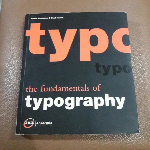 |
| Fig. 5.1 Book cover |
The Fundamentals of Typography offers incisive insight into typographic theory and practice. The subjects covered include a comprehensive introduction to the history of typography, typographic detailing, and the use of creative typography in print and online.
By reading this book, I learnt three new terms:
1. Surprint: it can be produced by when two elements of the same colour are printed on top of one another.
2. Overprint: it can be produced when two elements, usually with a darker colour printed over a lighter colour, is printed on one another.
3. Knockout: a gap left in the bottom ink layer so that an overprinted image will appear without colour modification from the ink underneath.
Week 11 (06/11/19)
Book title - Colour Basics Design #5
Author - Gavin Ambrose and Paul Harris
Author - Gavin Ambrose and Paul Harris
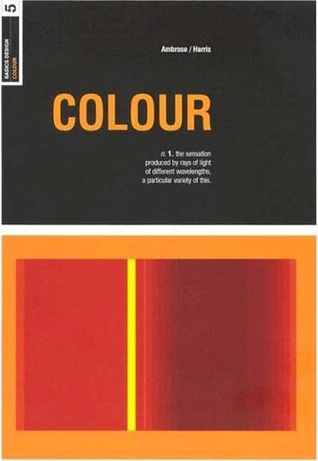 |
| Fig. 5.2 Book cover |
The book explores in-depth what colours mean, their inherent associations and their cultural connotations. Building on this information, it then tackles how to control colour in design in order to achieve the desired effect or fulfil a specific brief. Starting with the basic principles of colour – how light works, colour wheels, colour combinations and harmonies – the book builds on these principles and explains how the designer can accurately and intentionally control colour.
By reading this book, I learnt about creating an identity through colours.
Colour is often used to help to establish a strong and instantly recognisable identity for a huge variety of organisations and their associated products or causes. For example, dark blues are used to create conservative, dependable and trustworthy identities for bank and insurance companies; bright and primary colours are used to create identities for children's products.

Comments
Post a Comment